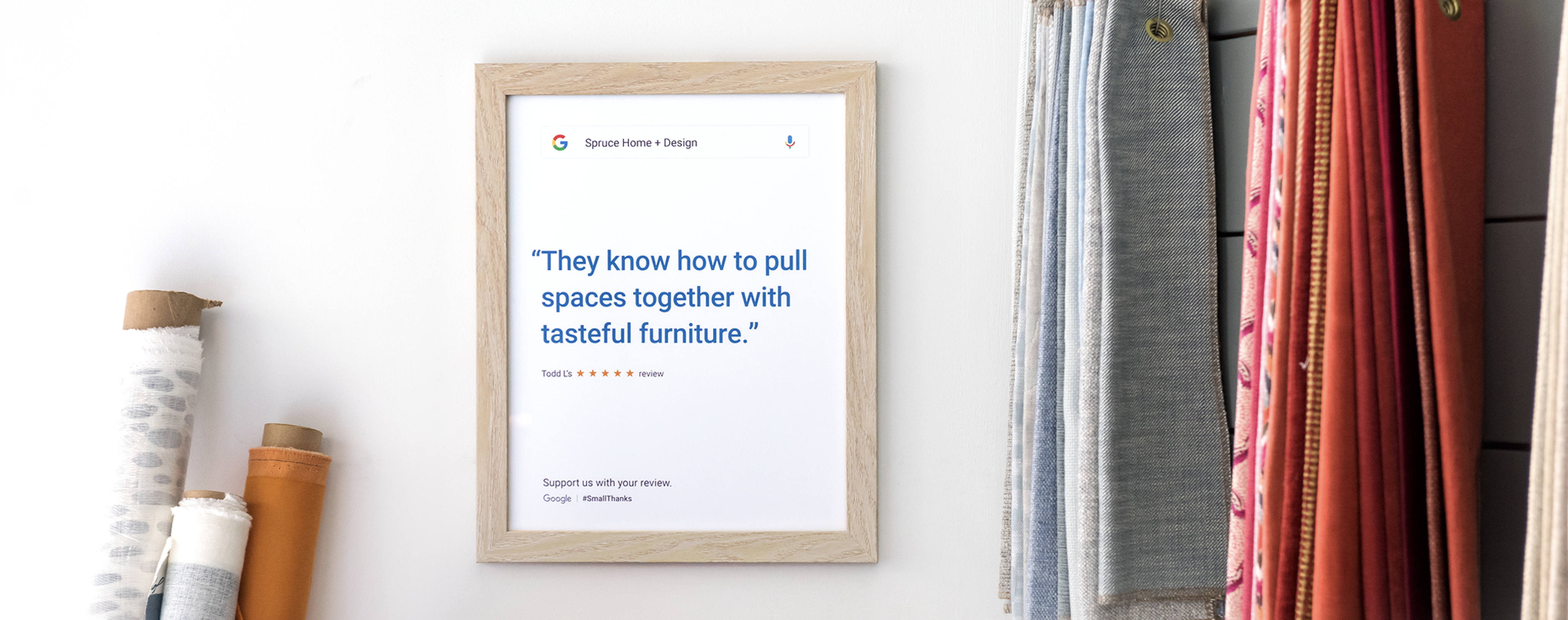


It’s easy to overlook small businesses because, well, they’re small. But the reality is small businesses make a huge impact on our economy, our local communities, and our daily lives – and they don’t often get the recognition they deserve.
My team at Grow partnered with Google’s Art, Copy, & Code team to launch Small Thanks: a platform offering free, customized marketing materials for every small business in America, powered by their Google data. We created Small Thanks to recognize our small businesses for all they do, and in turn drive more business their way.
Our saying goes: “A small thanks goes a long way.”
Contributions
Tools
Teammates
We began our project with a deep dive into Google’s qualitative research on small business owner & consumer mindsets. We surfaced these key motivations and challenges:
🙌 MOTIVATION
Small business owners are rewarded by people, not profits.
Customer satisfaction is the greatest reward for a small business owner. At the end of the day, what they care most about is people and the human connection–and ensuring they provide customers with the highest quality products or experiences.
🙏 CHALLENGE
Their craft is their passion, but business is work.
Small business owners are deeply passionate about their chosen trade, but have a love-hate relationship when it comes to the ‘many hats’ of ownership. The business side, especially marketing, feels outside their wheelhouse and like a chore – something they’d quickly outsource if they felt anyone could ‘get it right’.
🙌 MOTIVATION
Consumers want to be the type of people who support small businesses in their community.
Consumers know that shopping at small, independent businesses is the “right thing” to do and have absorbed “shop local” and “shop small” messages. They take pride in supporting small business experiences that are exclusive to their community.
🙏 CHALLENGE
It’s easier said than done.
They want to align their behavior with their value of community – but in practice, big business convenience and price points often win. Aside from shopping small, consumers don’t feel like they have other ways of supporting small businesses in their community.
Our insights into the motivations & challenges of small business owners and consumers informed our two-part strategy.
🤝 HELPING SMB’S
Make it easy to spread customer love.
Small business owners measure success in customer love and their reputation. As such, online reviews are critical to a business’ success. We can help small business owners by creating a one-stop marketing tool that amplifies the things customers love about their business – all based on reviews.
👏 HELPING CONSUMERS
Make it aspirational to be a small business ally.
The best way to give thanks to a small business is with a great review. We can help consumers become small business allies by turning their online reviews into points of pride for themselves and the businesses they support.
To bring our strategy to life, we built an engine that collects a business’ top Google reviews and stylizes them into works of art. Here’s how we built the engine:
STEP 1
Using star ratings and sentiment analysis (via natural language processing), we extracted the best reviews for each business from their Google profiles.
STEP 2
From the curated reviews, we used natural language processing to extract the strongest snippets and identify each word in order to inform the creative styling and visual hierarchy.
STEP 3
We applied predefined artwork styles (more on this in the next section!) to the plain text review snippet. Our artwork design system allowed us to tweak the colors, fonts, and layouts of each asset.
STEP 4
We then export the artwork into a digital format that can be downloaded, shared, or printed.
For our project to be successful, we needed to create review artwork that business owners and consumers would want to share. At the same time, we needed to brand the artwork in a subtle, yet undeniably Google way. To ensure we achieved both goals, we approached the artwork design content-first.
STEP 1
Before diving into visual design, we explored content structures to determine what information needed to be included in each piece of art and how the information needed to be prioritized. At a baseline, we knew we needed to include:
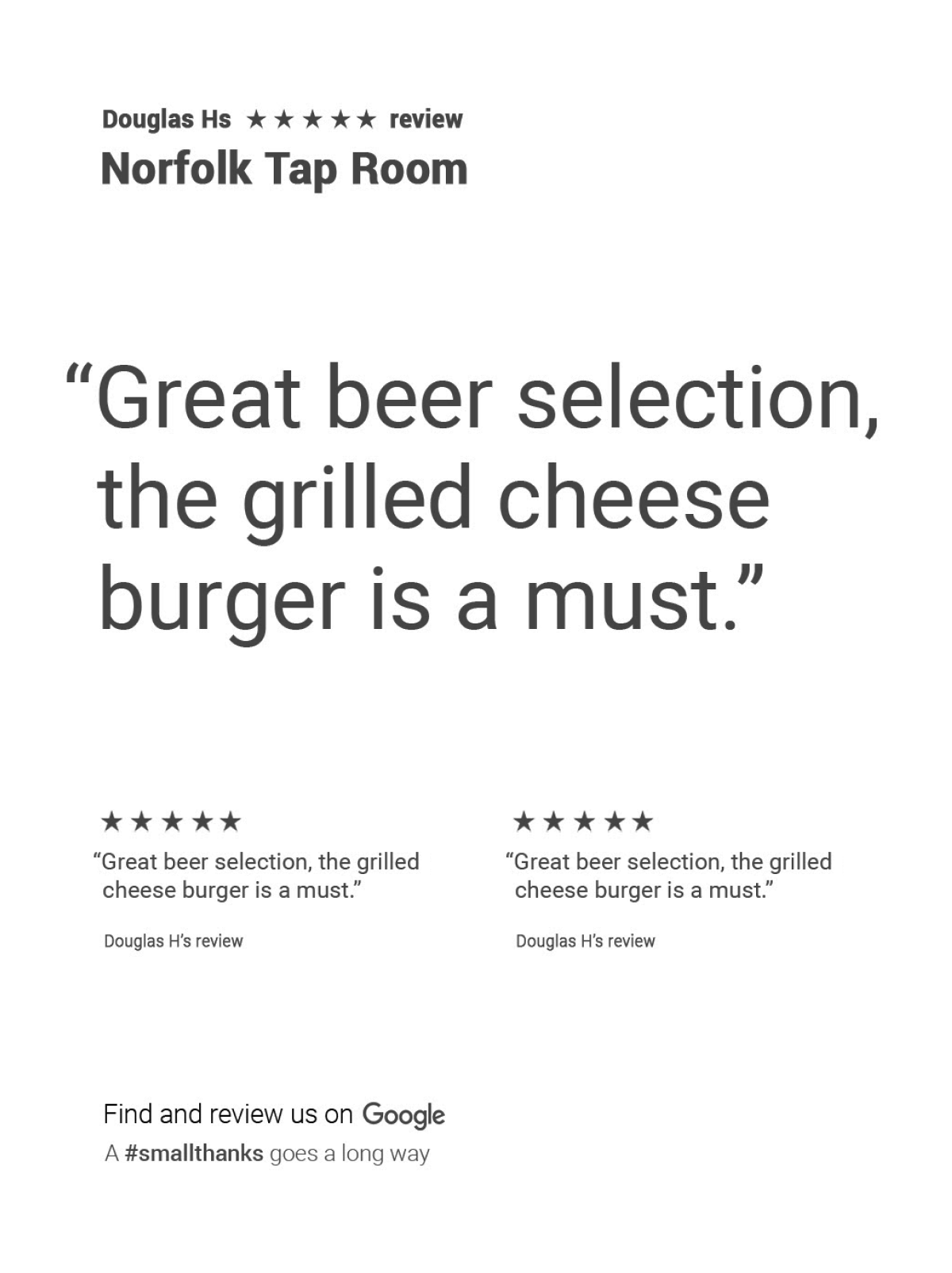
We explored structures that emphasized different elements & included different number of reviews.
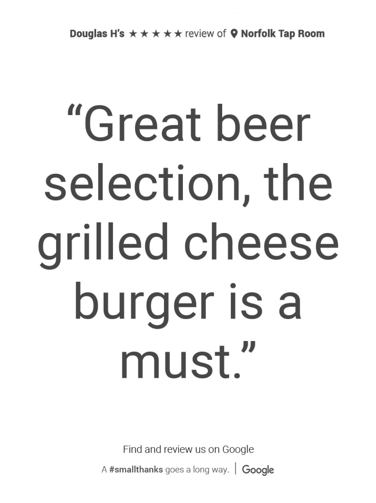
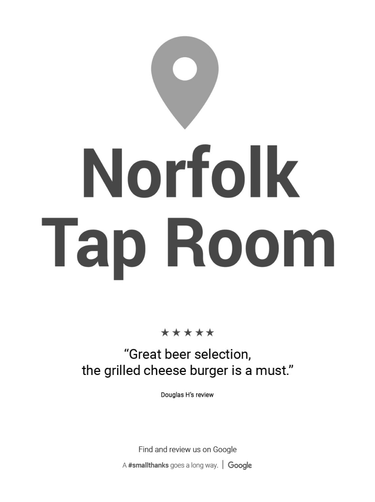
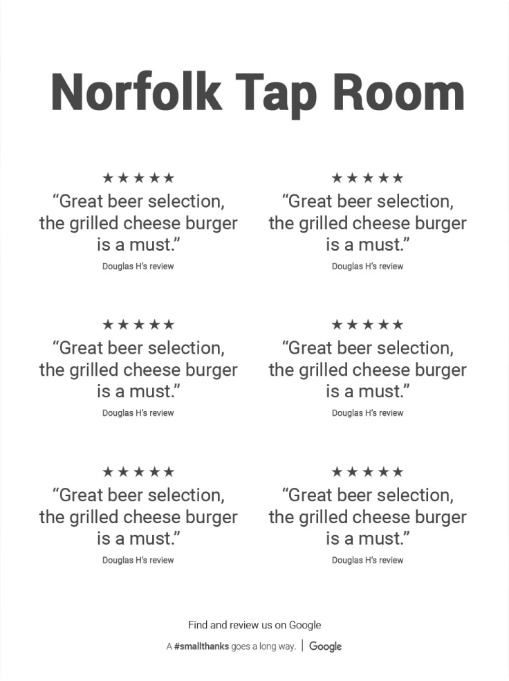
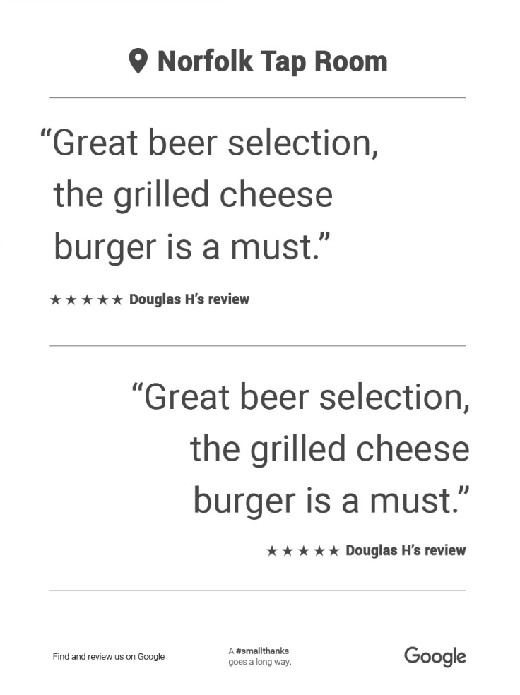
With the goal of turning the reviews into share-worthy artwork in mind, we aligned on the following wireframes:
Single Review
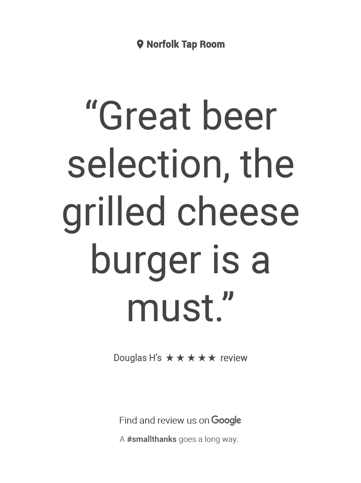
Multi Review
STEP 2
With a wireframe structure defined, we could go wide with our design exploration. And wide we went!
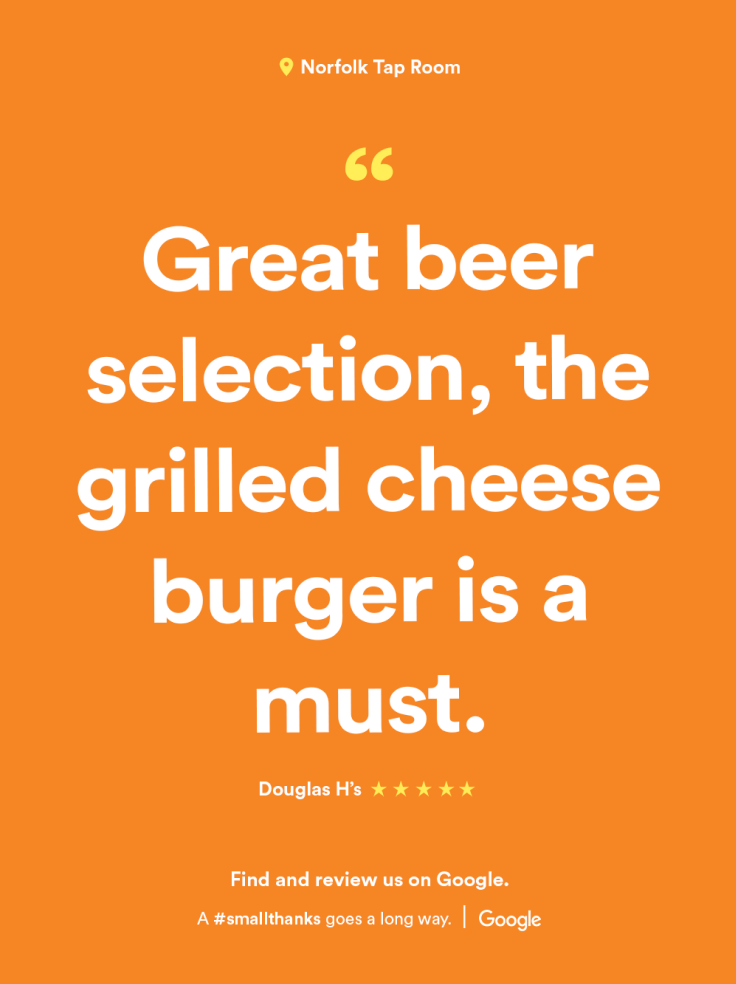
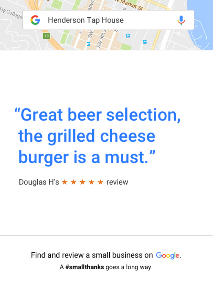
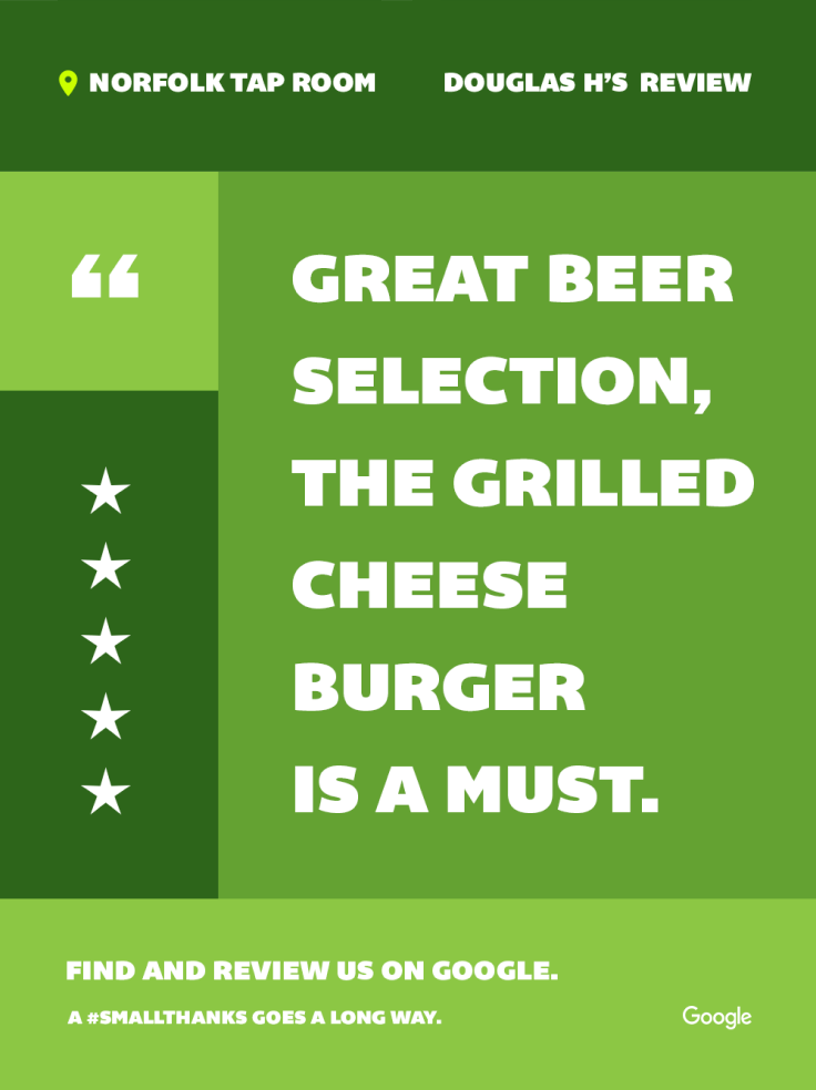
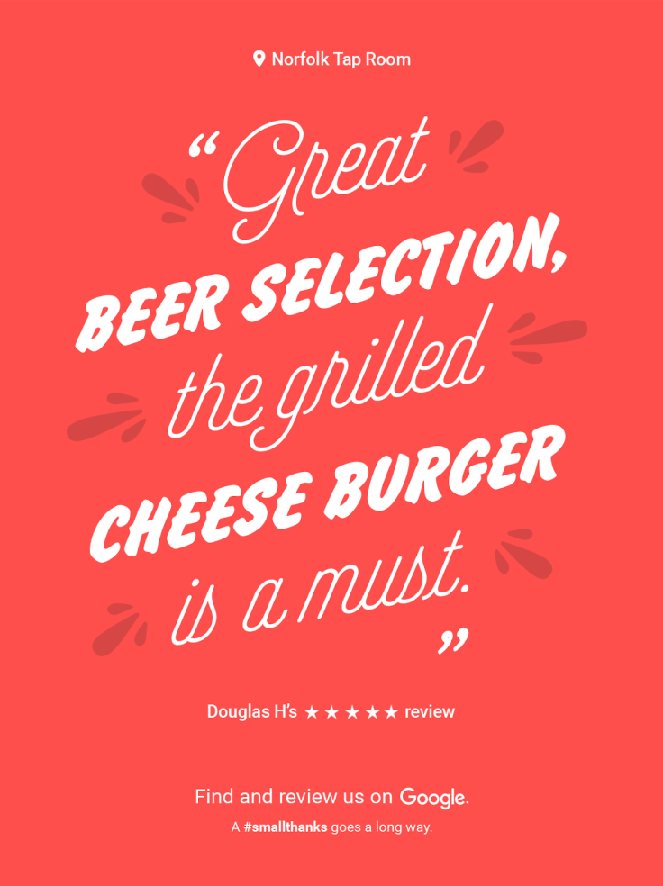
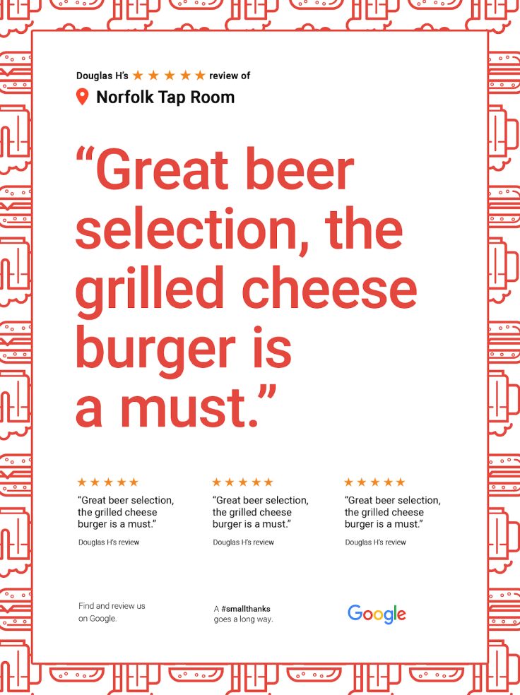
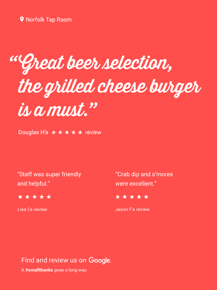
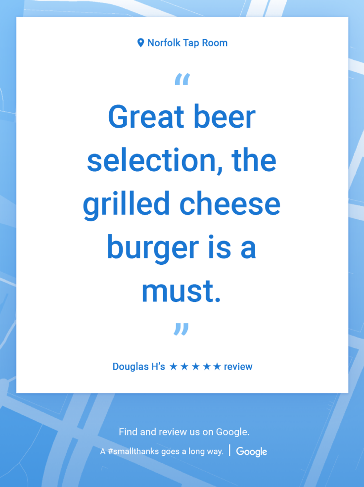
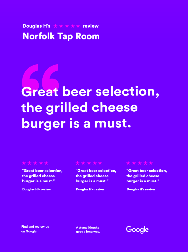
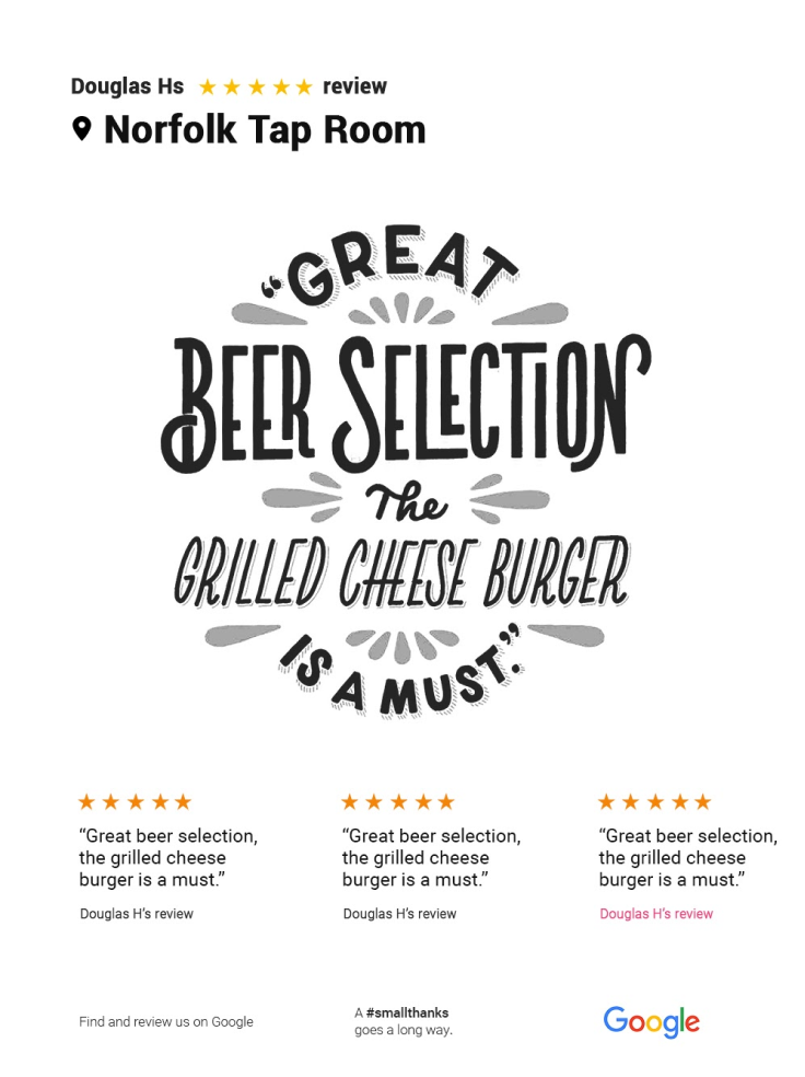
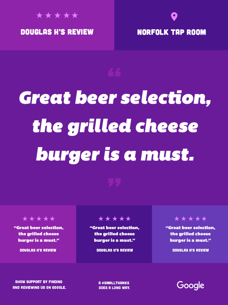
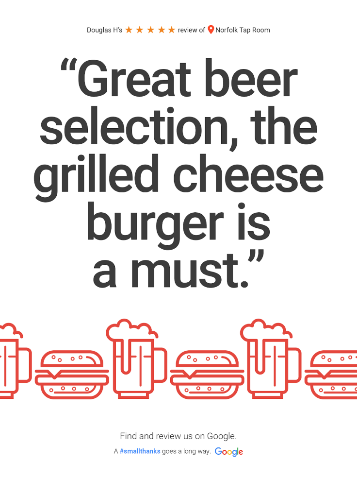
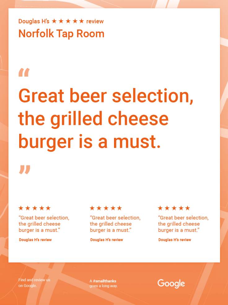
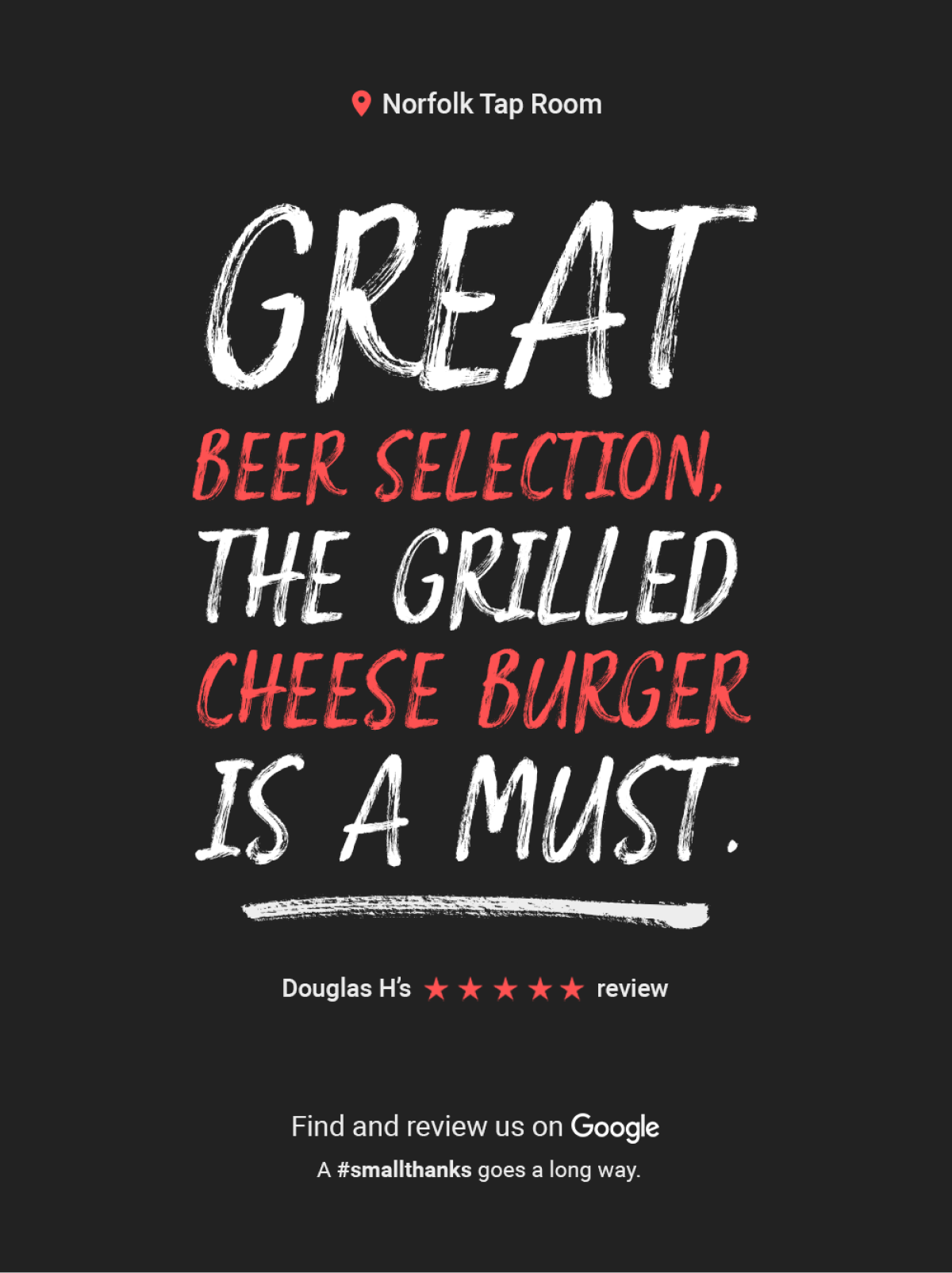
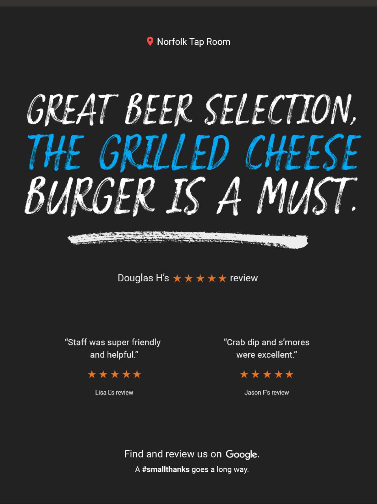
For the initial launch, we moved forward with 3 styles:
Sign Script - Single Review
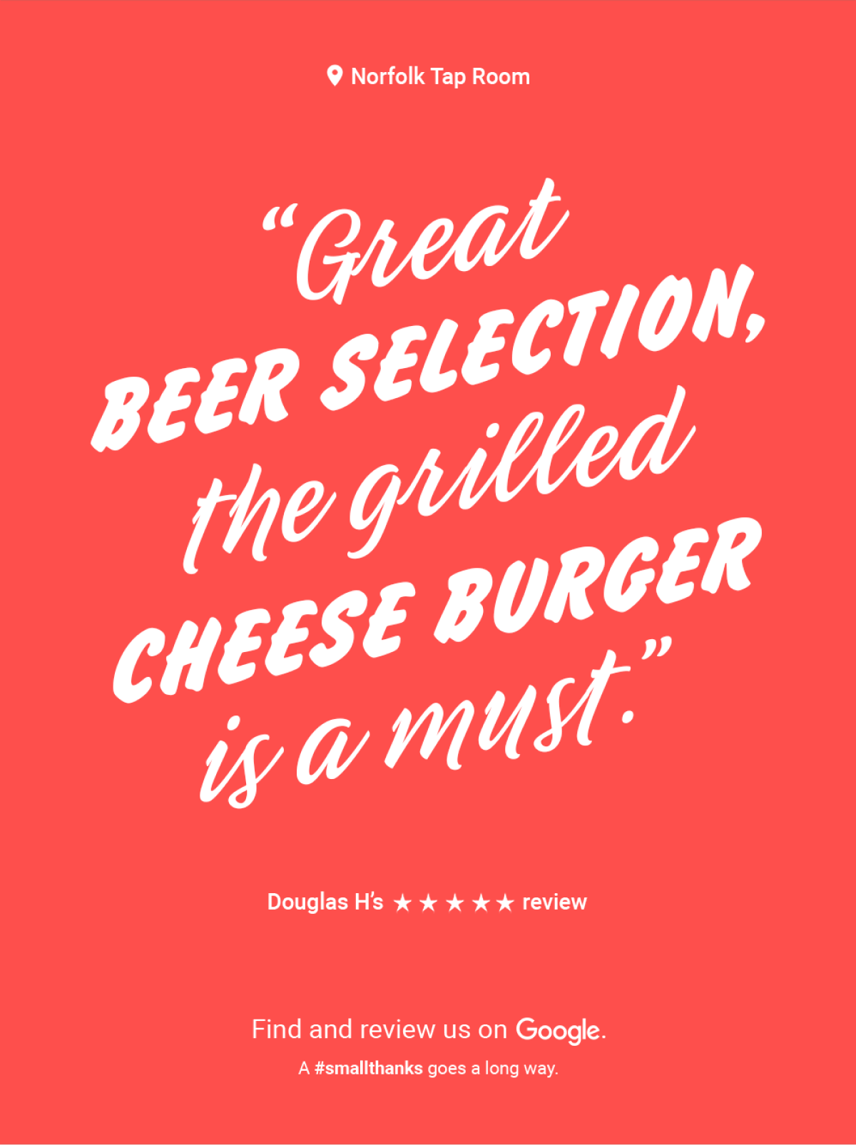
Sign Script - Multi Review

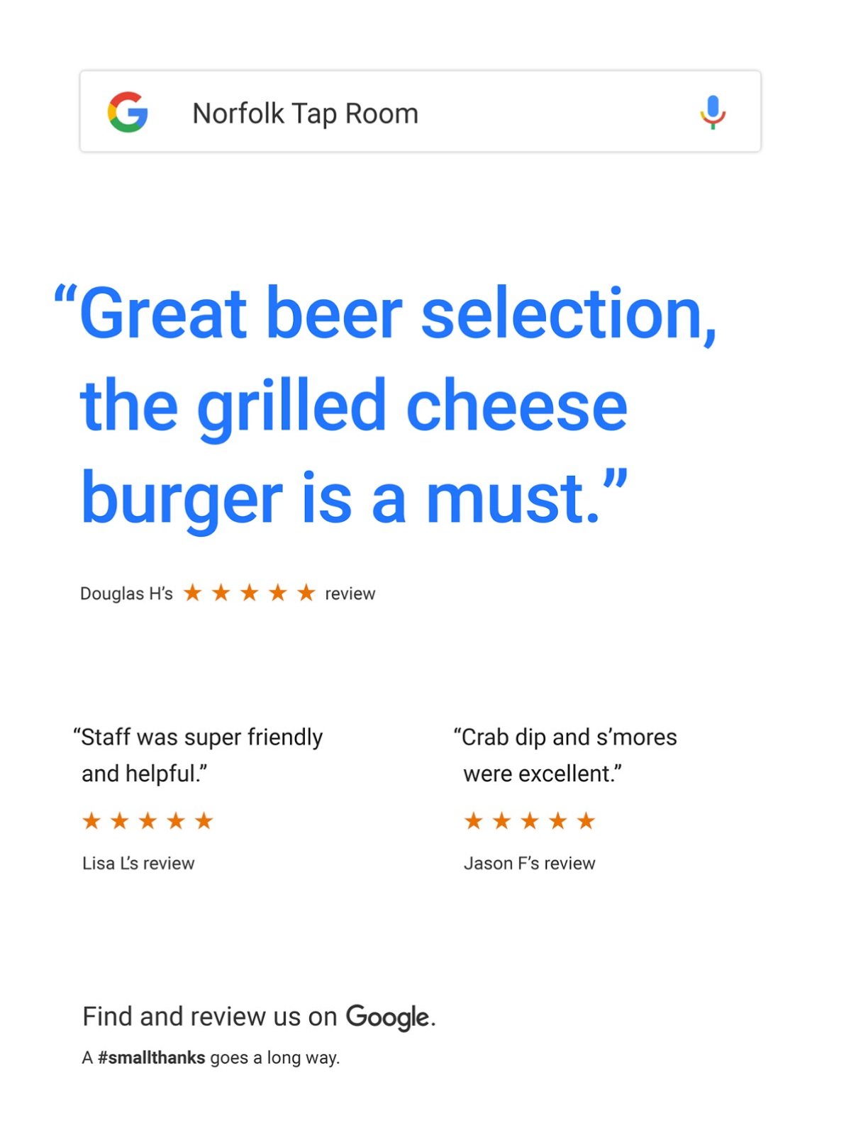
Google - Single Review
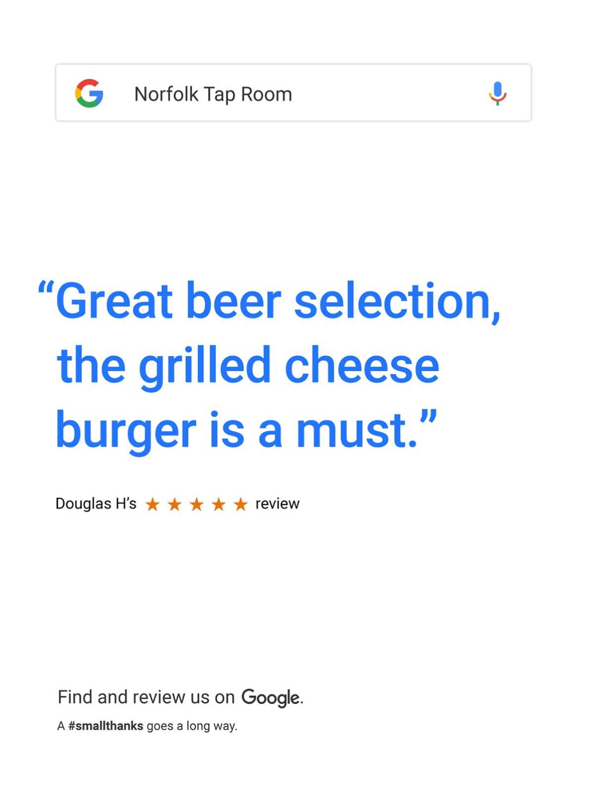
Google - Multi Review
Chalkboard - Single Review
Chalkboard - Multi Review
With an engine in place & its products defined, we built a platform for small business owners to access their review artwork, customize it to their liking, and share it everywhere – from their storefront to their social media accounts. Here’s how we built the platform:
STEP 1
Save business owners time.
Serve them assets they can use right away. At any point – whether they choose to customize the asset or not – let them download, print, or share.
Put business owners in control.
If they do choose to customize their artwork, make it easy for them to change the reviews or styles.
Raise awareness.
When appropriate, educate businss owners on the positive impacts of listing and verifying their business on Google.
STEP 2
To design the best experience for business owners, we needed to understand how they would get to our platform. We created an entry flow to map out the pages we needed to design & what content would live on these pages.
With the entry points defined, we dove into the full user experience. Based on direct requests from small business owners for a mobile-friendly tool, we prioritized the experience on mobile:
Home Page
Business Page
Business Page - Customize
Review Page
STEP 3
Throughout the wireframing process, we created clickable InVision prototypes that allowed us to quickly test & refine user flows and content hierarchy.
Home Page
Business Page
Business Page - Customize
Review Page
We shared these prototypes with a select group of small business owners, observing what they found helpful & intuitive, and, perhaps more importantly, what wasn’t.
Home Page
Business Page
Business Page - Customize
Review Page
Home Page
Business Page
Business Page - Customize
Review Page
STEP 4
Our prototyping process helped us wireframe a responsive platform that served business owners throughout the experience.
Desktop
Mobile
Desktop
Mobile
Desktop
Mobile
Desktop
Mobile
Desktop
Mobile
We launched the platform on National Small Business Week 2017. We worked closely with Google to plan the launch, which included capturing original assets for a blog post and an email to every small business owner on Google.
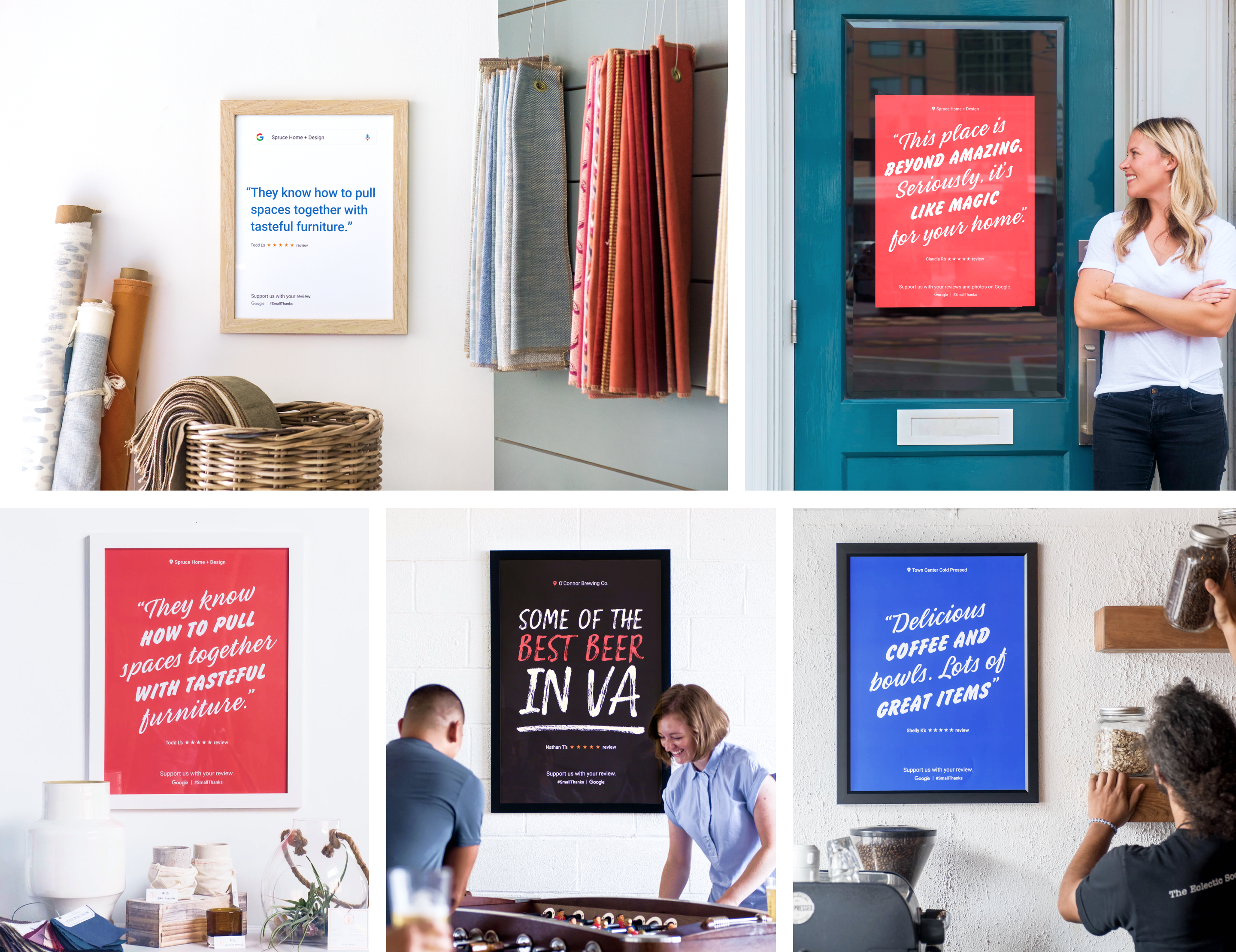
To show small business owners how our platform could help them, we directed a photoshoot featuring real review artwork for small businesses in Norfolk. We worked with photographer Todd Wright to capture small businesses that represented a variety of business verticals.
In its first year, the Small Thanks platform had 113K unique users. Additionally, over 20% of visitors downloaded or shared a Small Thanks asset.
The positive feedback Google received from small business owners and Google business partners led to our continued relationship with the Art, Copy, and Code team. When the Art, Copy, and Code team was absorbed into the Google My Business team in 2018, Small Thanks received even more support. The Google team has since built on our existing website structure and poster designs to offer business owners even more assets to promote their business.
In the 6 months my team took Small Thanks from concept to launch, we learned several valuable lessons that positively impacted the way we approach our design process & client relationships.
Takeaway 1
We needed to remember that we weren’t designing the posters for ourselves – so our personal design preferences weren’t necessarily what would resonate with our audience.
Takeaway 2
Creating wireframes is an exercise in instilling hierarchy. Aligning on a wireframe creates a shared understanding of what’s important.
Takeaway 3
Being a good partner means being invested in the project’s success, even when your part is done.
If you’d like to learn more about this project, I’d love to hear from you. I’d be happy to share how this work has performed since its launch, and how we can work together to launch your projects.
You can reach me by email at janice.jamye.pang@gmail.com 💌