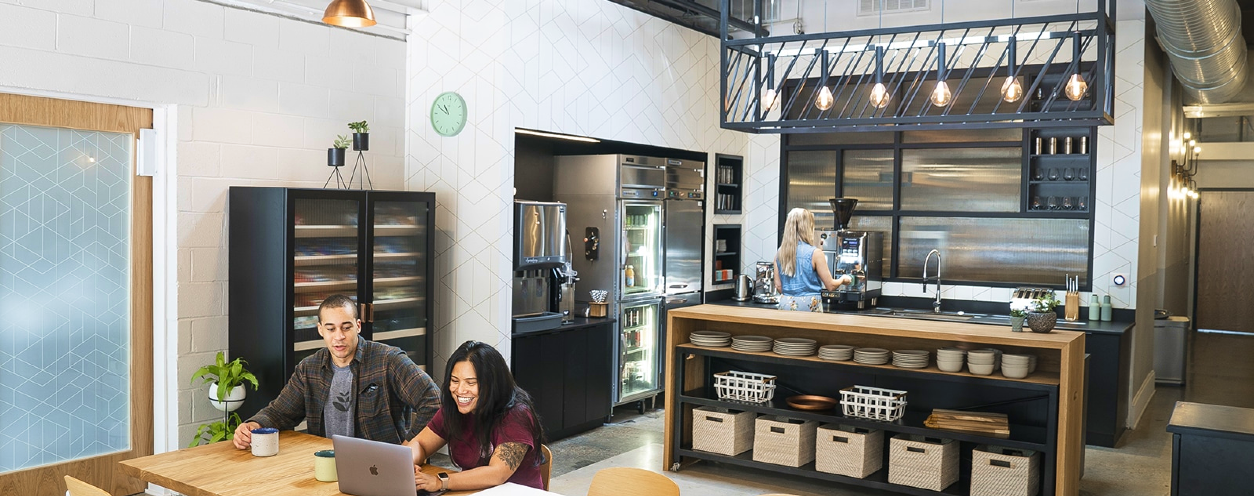
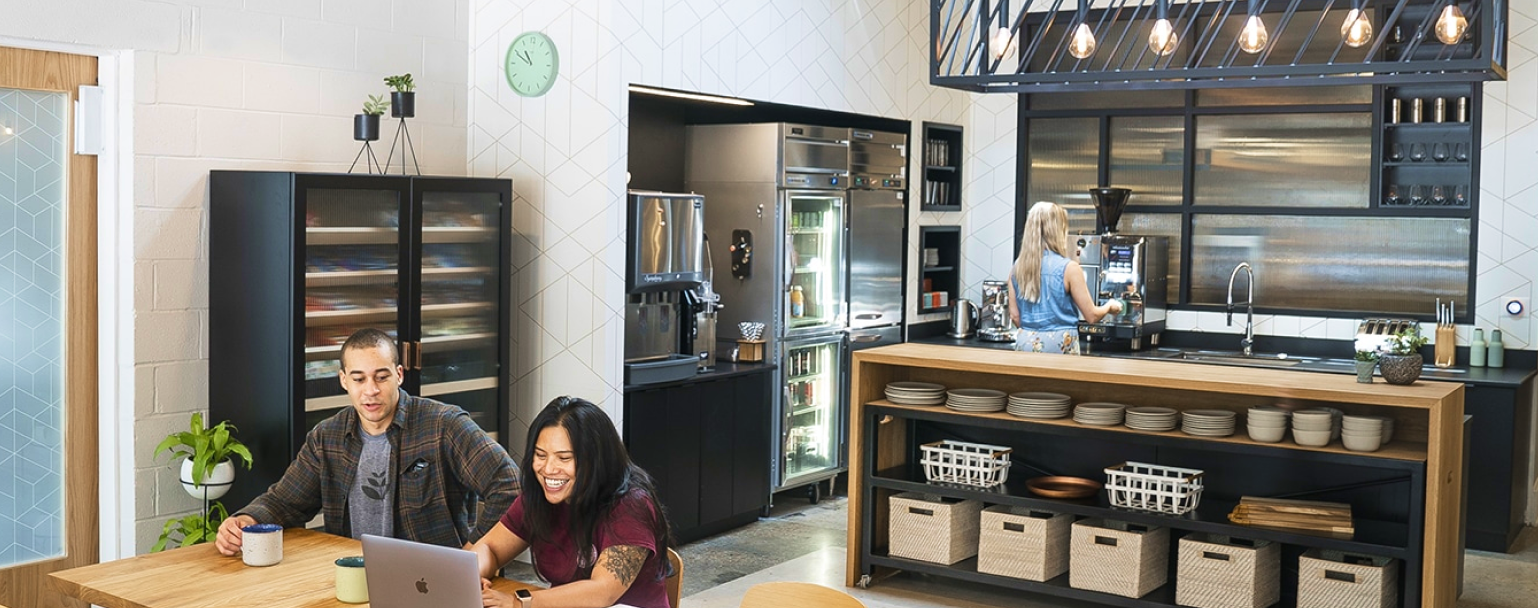


The interior of ENJOY: photographed by Mike Washington
In December 2017, Field Guide closed its doors. On a personal level, I lost one of my favorite lunch and dinner joints; on a community level, Norfolk lost a gathering place.
The following fall, Grow opened the doors to ENJOY: in Field Guide’s place. Following the restaurant’s communal model, Grow developed the space to serve as the lunchroom and common space for its 50+ employees during the day, and to reconfigure at night to fit the experiential needs of various pop-ups.
I worked with a small group at Grow to craft ENJOY:’s brand & marketing system, directing the brand’s physical and digital presence.
Contributions
Tools
Partners
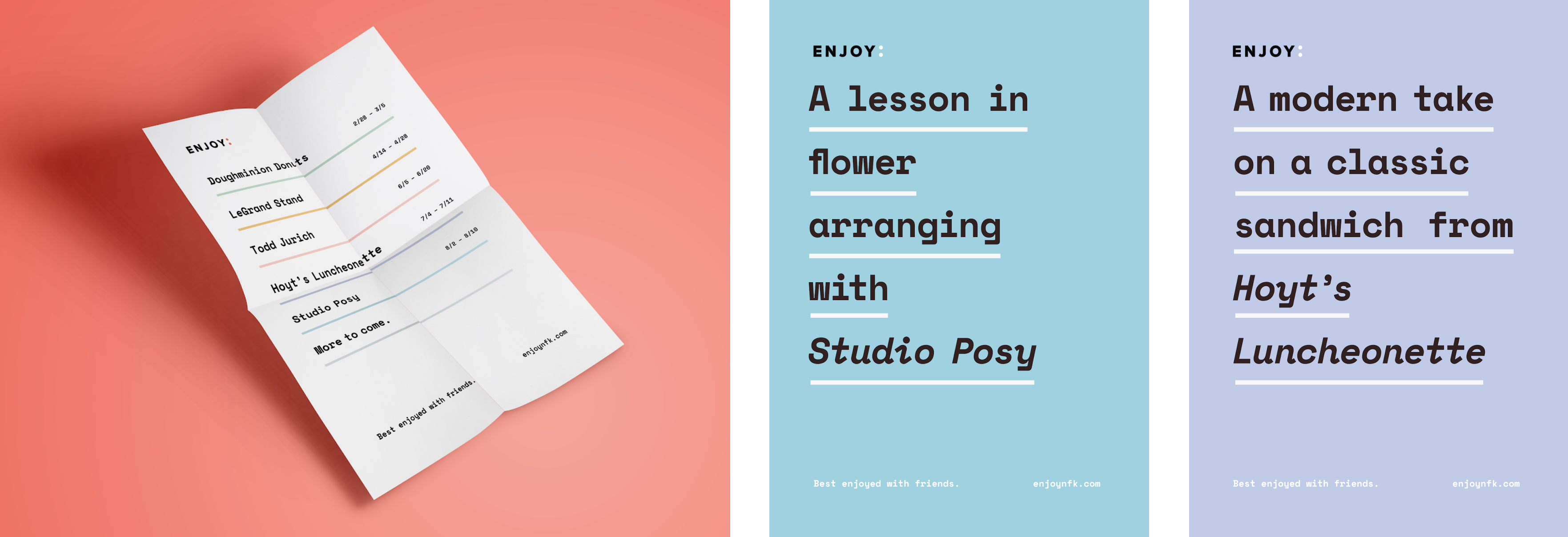
We saw the space as an opportunity to celebrate creative expression — both for the agency and for Norfolk’s broader community – and we wanted to name to reflect that.
ENJOY:
With a name to build on, I explored design concepts with physical & digital applications in mind. Here’s a sample of the digital explorations:
Concept 1
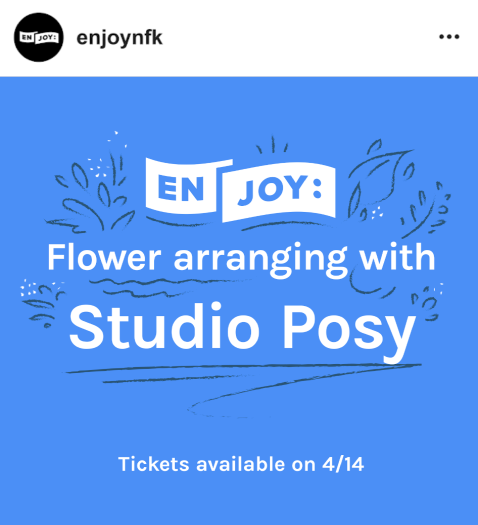

Concept 2
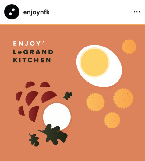
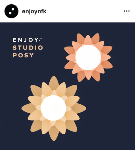
Concept 3
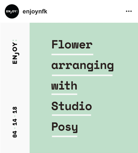
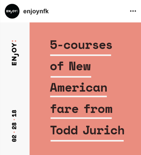
We solidified the brand by combining the best aspects of each concept – the excitement of Concept 1; the refinement of Concept 2; and the quirkiness of Concept 3 – drawing from the visual language in Concept 3.


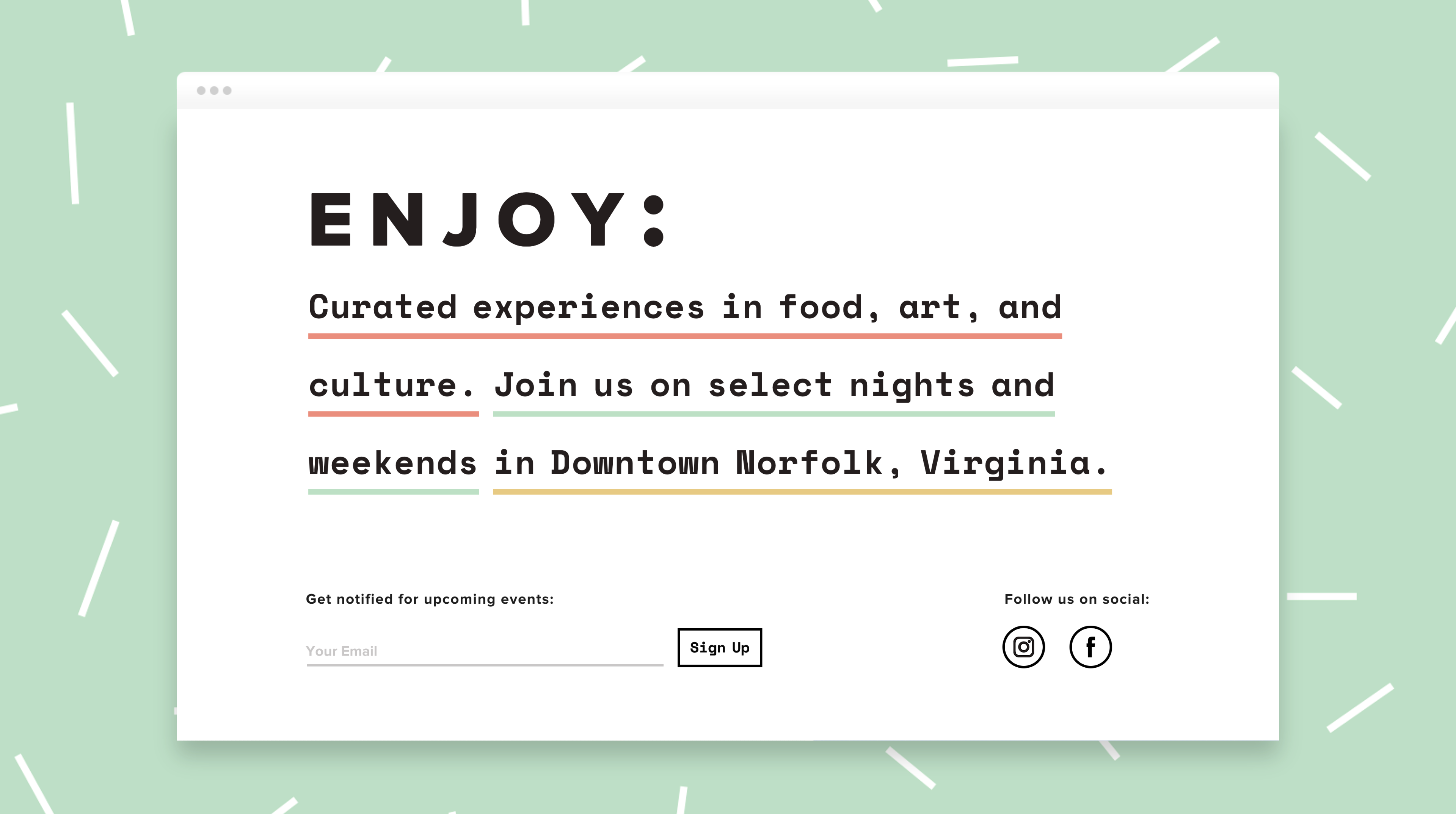
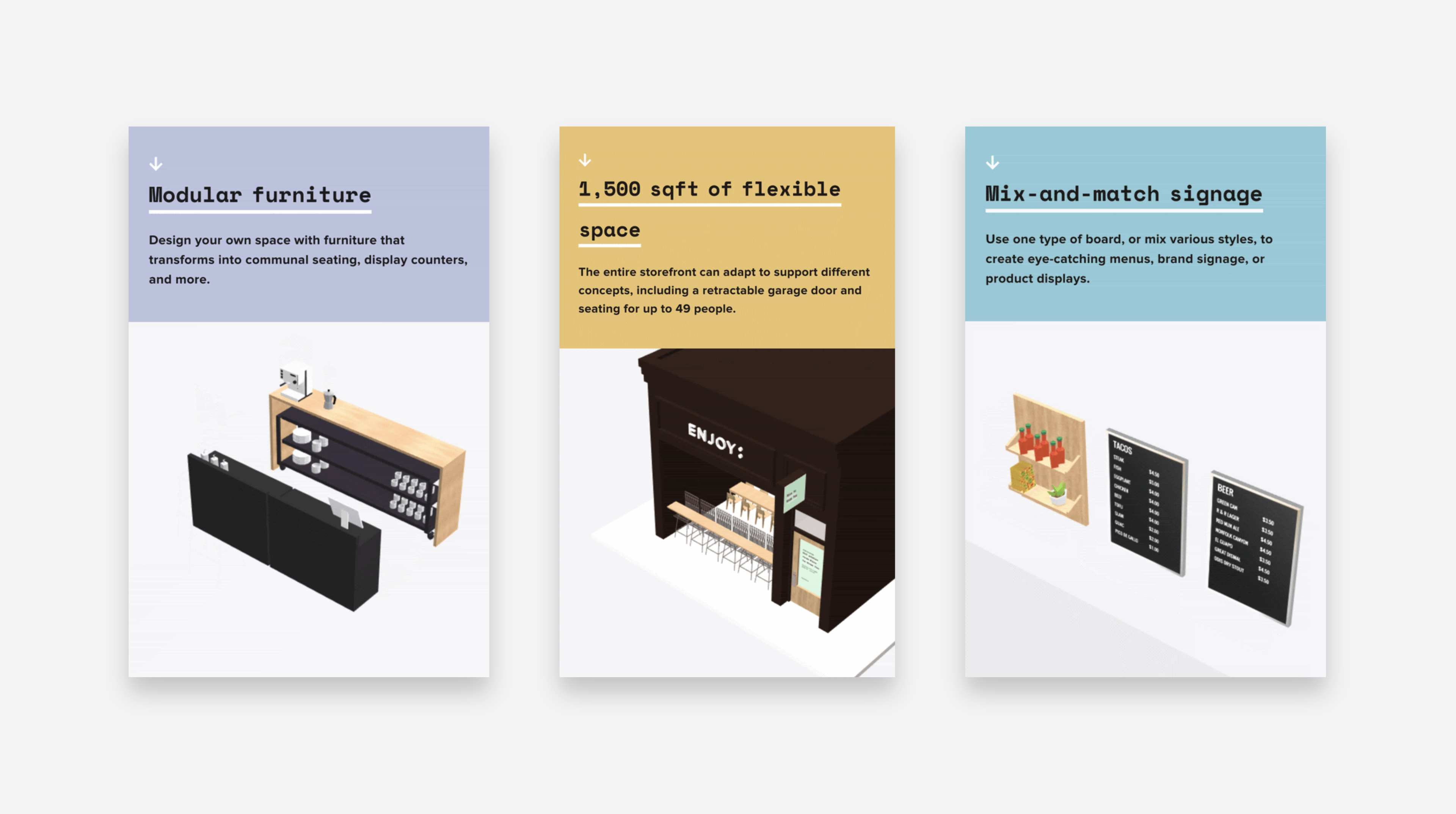
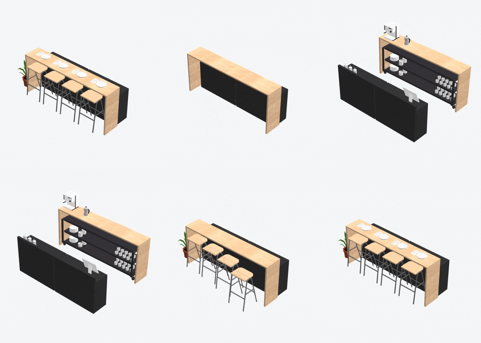
Before opening ENJOY:’s doors to the public, we introduced the concept and the brand with a website that showcased the space’s potential. The website was our opportunity to show how every aspect of the space is dynamic — from menu boards that turn into product displays, to a bar that transforms into a display counter.
Landing Page - Desktop
Space Configurations – Mobile
Multifunctional Bar
Modular Shelving

1
Since opening in 2018, ENJOY: has hosted over 20 events – including chef pop-ups, documentary screenings, art galleries, and professional development workshops.
2
I’ve worked with 3 operating managers to ensure brand consistency.
3
I hosted my own event at ENJOY: in August 2019 & got to put the brand system to the test. Check out photos from my Zine Swap event below!
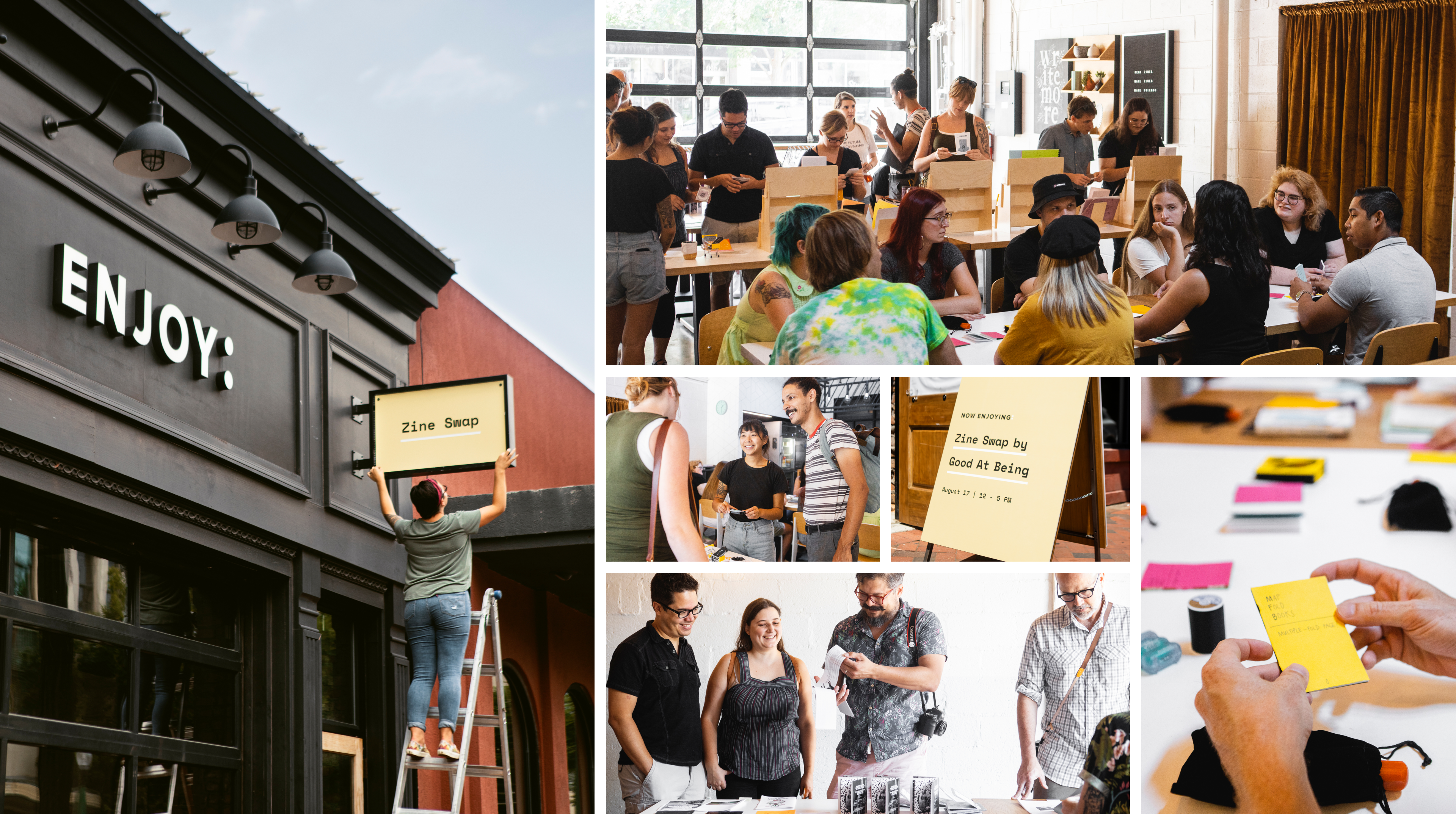
Photos by Mike Washington
If you’d like to learn more about this project, I’d love to hear from you. I’d be happy to share how the branding has taken shape, and how we can work together to shape your brand.
You can reach me by email at janice.jamye.pang@gmail.com 💌