
Bringing awareness to Google's best-kept secret.
Billions of people trust Google's products to help them every day — that’s why helpfulness is at the core of their mission. Being helpful also means being responsible and preventing harm for their users and for society as a whole. That’s where the Google Trust & Safety team comes in.
The Trust & Safety team produces critical research to inform policies on online issues like abuse, fraud, and spam. This research has profound impact within and beyond Google, yet it suffers from being unknown.
My team at Grow worked closely with the Trust & Safety (T & S) team to create a digital platform that brings their research to light, extending the reach and impact of their work.
Contributions
- Content Strategy
- UX Design
- Visual Design
- Client Comms
Tools
- Figma
- InVision
- Google Slides
Teammates
- Joe Branton
- Kim Coghill
- Ashley Hill
- Meg Linen
- Josh Newton
- Jessica Stratton
- Nate Witte

Gathering context
Before deciding what we were going to create, we needed to know how we could be most helpful. We interviewed 9 stakeholders to familiarize ourselves with the T & S team, their research, and the audience they were trying to reach. Here's what we learned:
Our Audience
The T & S research team has 3 key audiences. We define these audiences by how they interface with the research.
AUDIENCE 1
Super Users
“I want to know what research has been done on X and how that research was conducted to inform my own work.”
Super Users are...
- T & S researchers within Google
- Other Google researchers
- Researchers in academia, non-profits, and think tanks
AUDIENCE 2
Engaged Users
“I’m working on a project that needs to take X into consideration, and I want to see what guidelines are available.”
Engaged Users are...
- Google product & policy teams
- Tech industry T & S teams
AUDIENCE 3
Occasional Users
“I need to engage in the public dialogue about X, and I need research insights to help shape that conversation.”
Occasional Users are...
- Google marketers
- Government officials
- Media organizations
Their Barriers
We were surprised to find that though the key audiences vary in role, they experience similar barriers to engagement with the T & S team and their research.

Formulating the content strategy
The barriers our audiences experienced guided our content strategy, leading with a series of principles & recommendations to inform the platform's architecture.
Guiding principles
Principle 1
Our audience should feel confident in their choice to engage with the T & S team and their research.
Recommendation 1
The platform should clearly position who the T & S team is, what their work encompasses, and how their audiences can reach them.
Principle 2
Our audience should feel empowered to find the research they need.
Recommendation 2
The platform should guide audiences down pathways based on their needs and give them appropriate ways to engage with the research.
Principle 3
Our audience should feel compelled to discover new research.
Recommendation 3
The platform's content should evolve with the T & S landscape and should surface the most helpful research for our audiences.
Information Architecture
We put our principles into action, mapping our recommendations onto 3 page types:
Wireframing solutions
With an architectural plan to build on, we wireframed content layouts for each of the 3 page types – evaluating the hierarchy in each iteration for usability and clarity.
During this wireframe sprint, we designed our wireframes in Figma. This enabled the design team to rapidly build on one another's ideas, and promoted co-creation between the design and development teams.
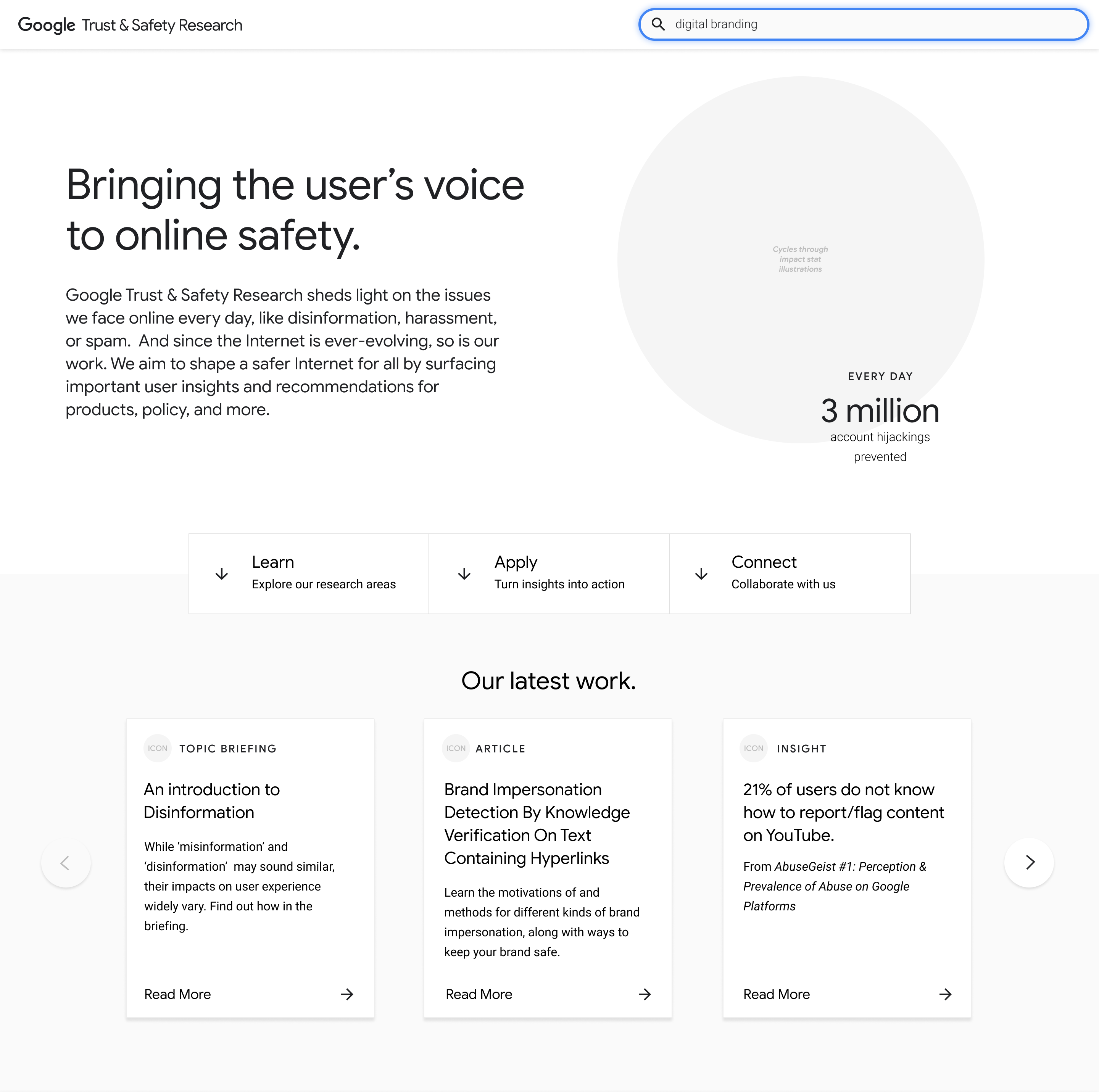
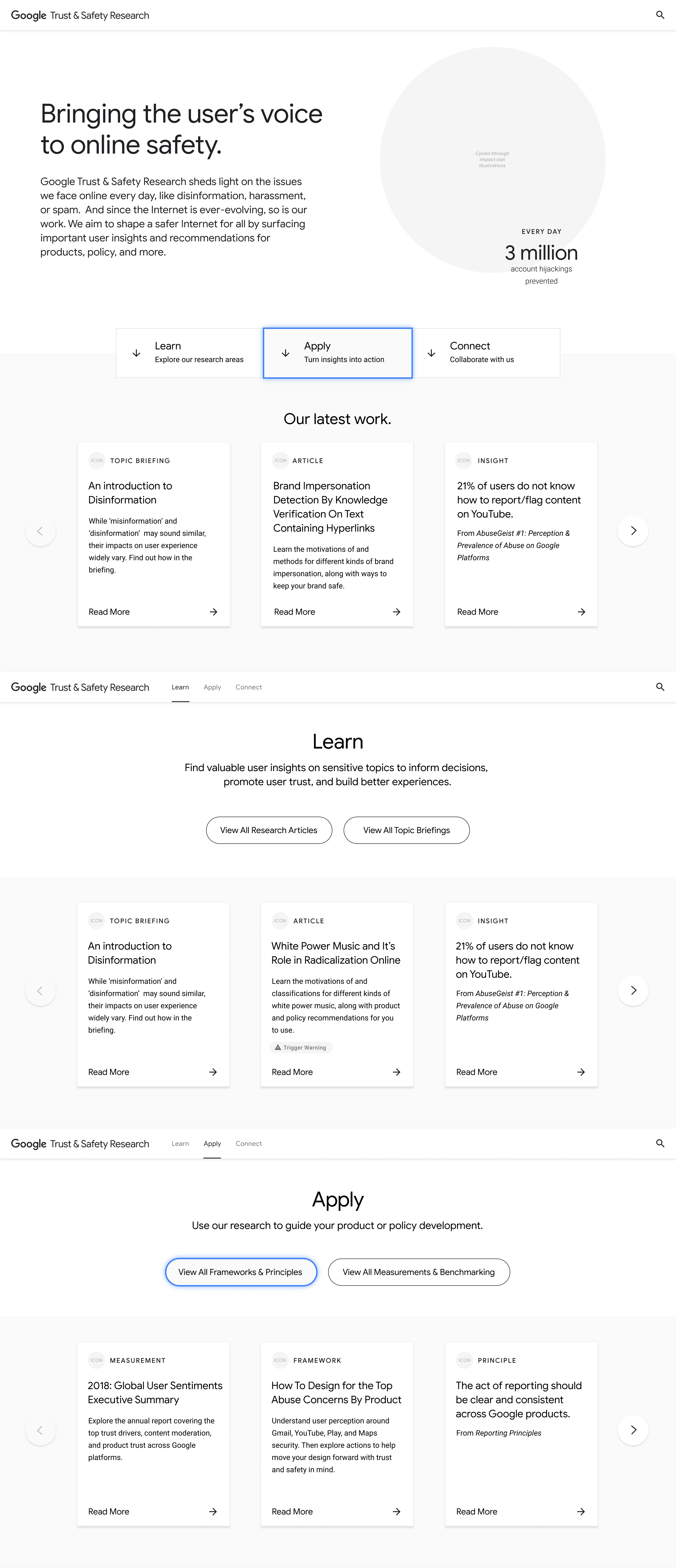
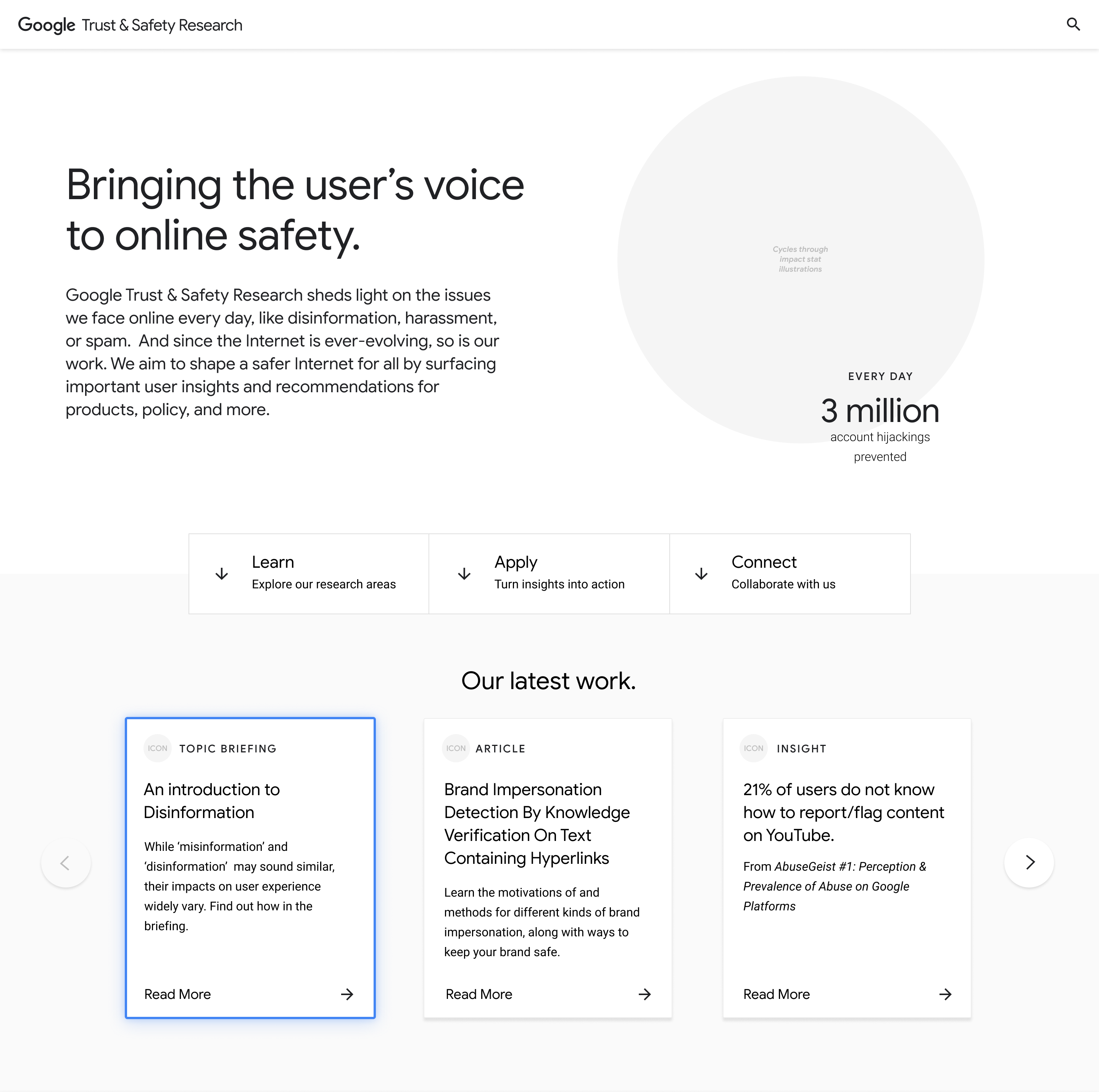
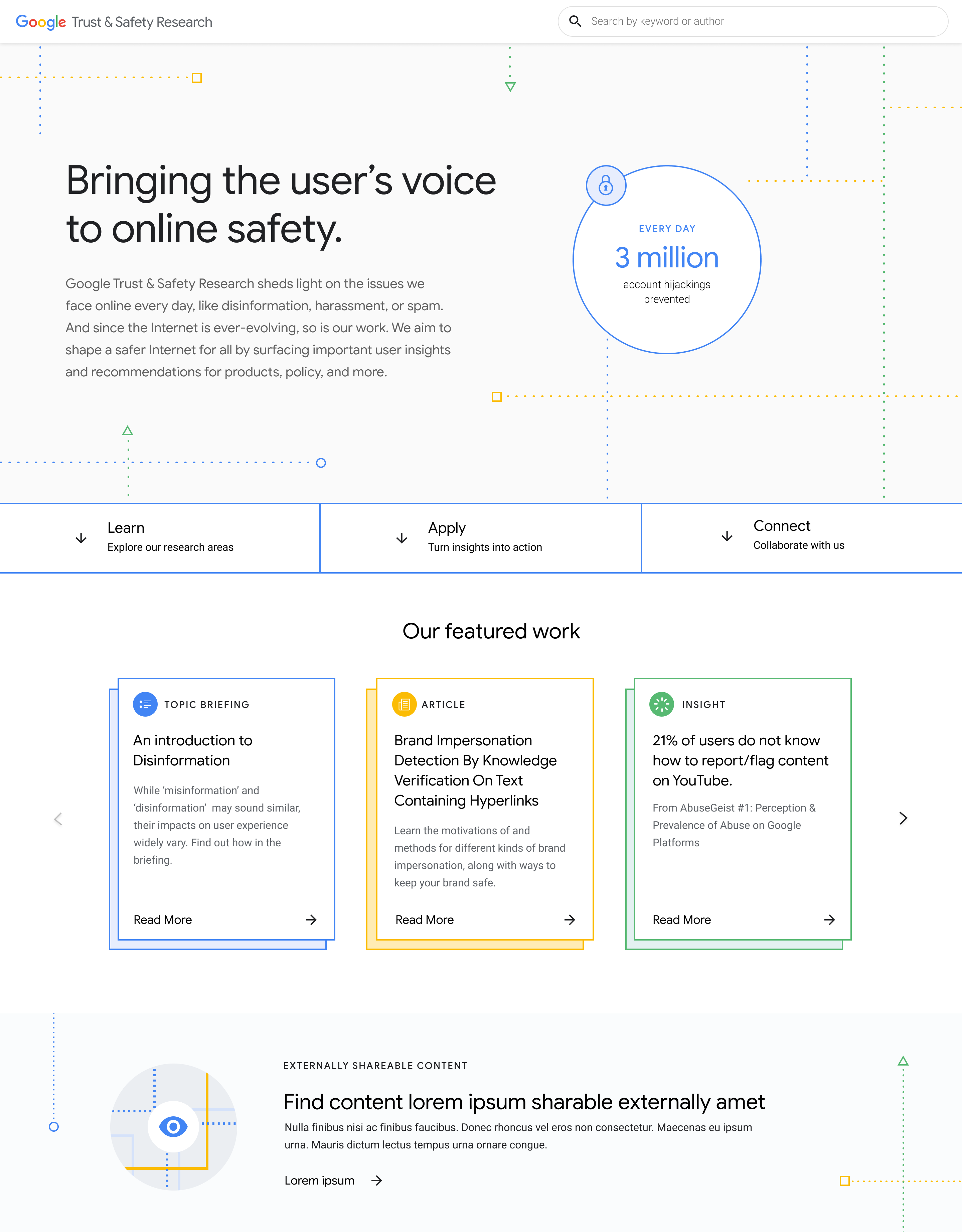
Landing Page
As the first T & S touchpoint, this page is the first opportunity to inform, impress, and serve our audiences. We explored ways to:
- Establish the T & S mission.
- Highlight the impact of the research.
- Surface the most notable research.
- Provide helpful pathways to engage with the research based on needs.
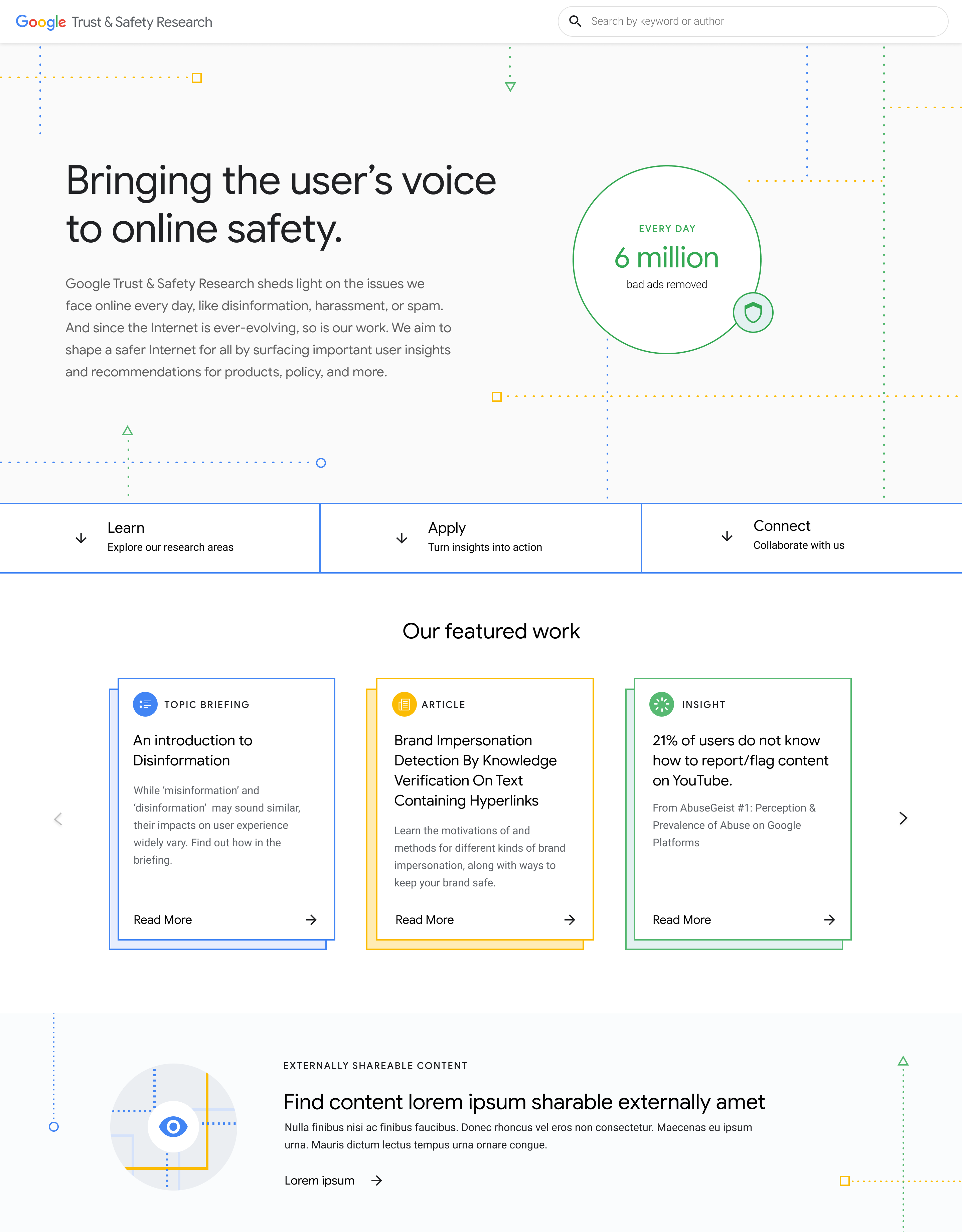
Selected Landing Page
Additional exploration
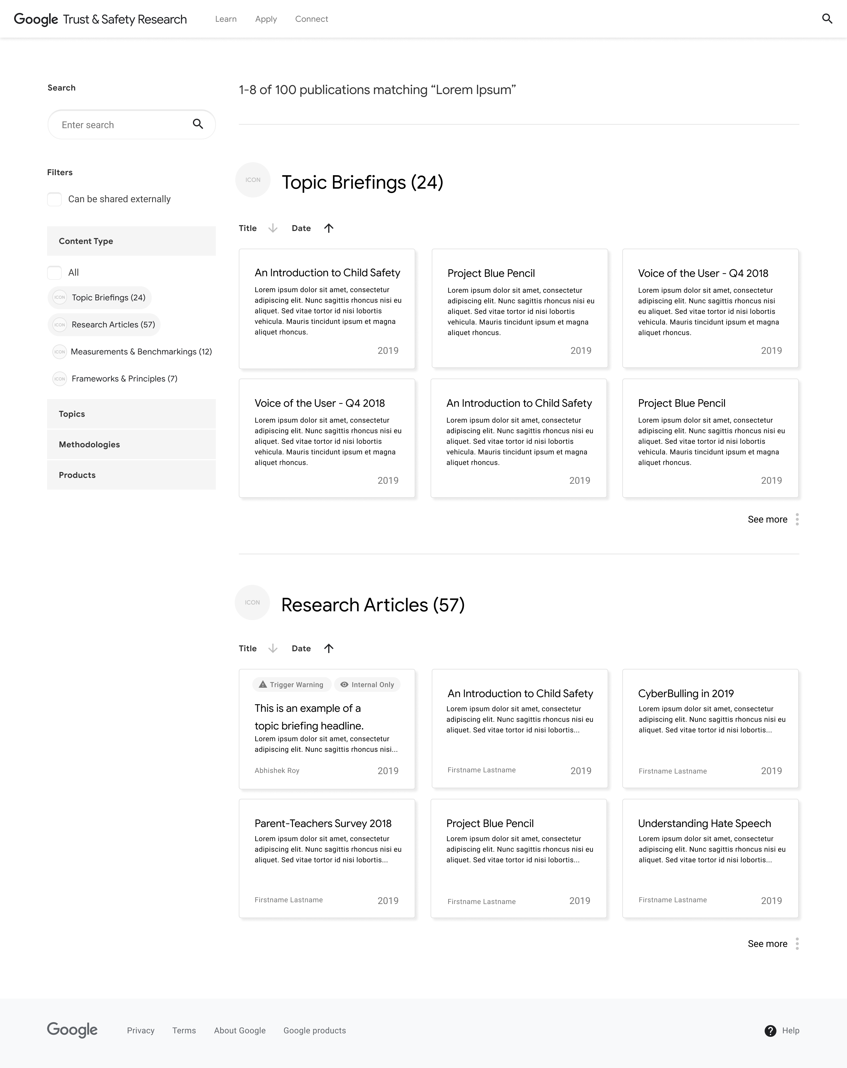
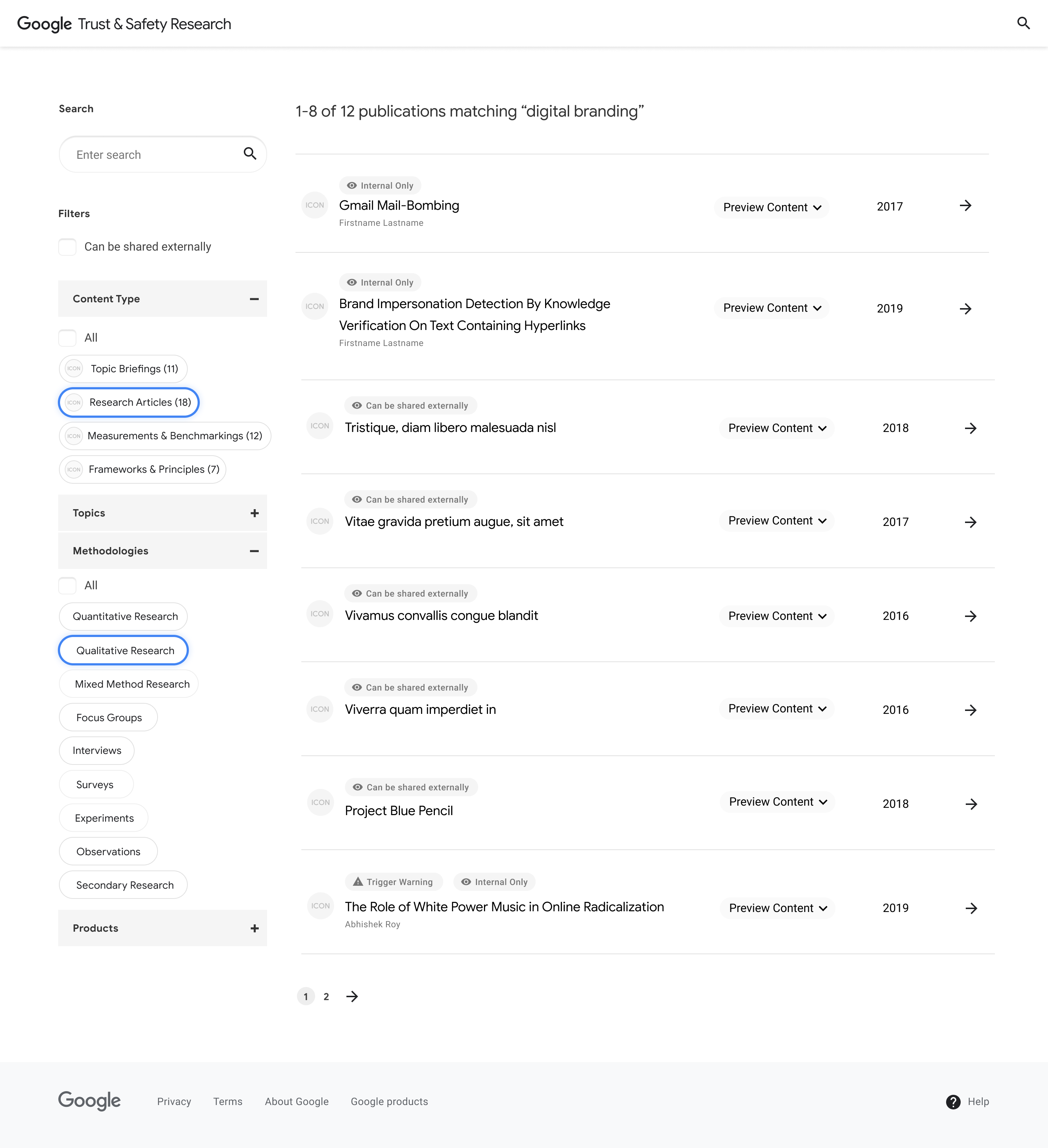
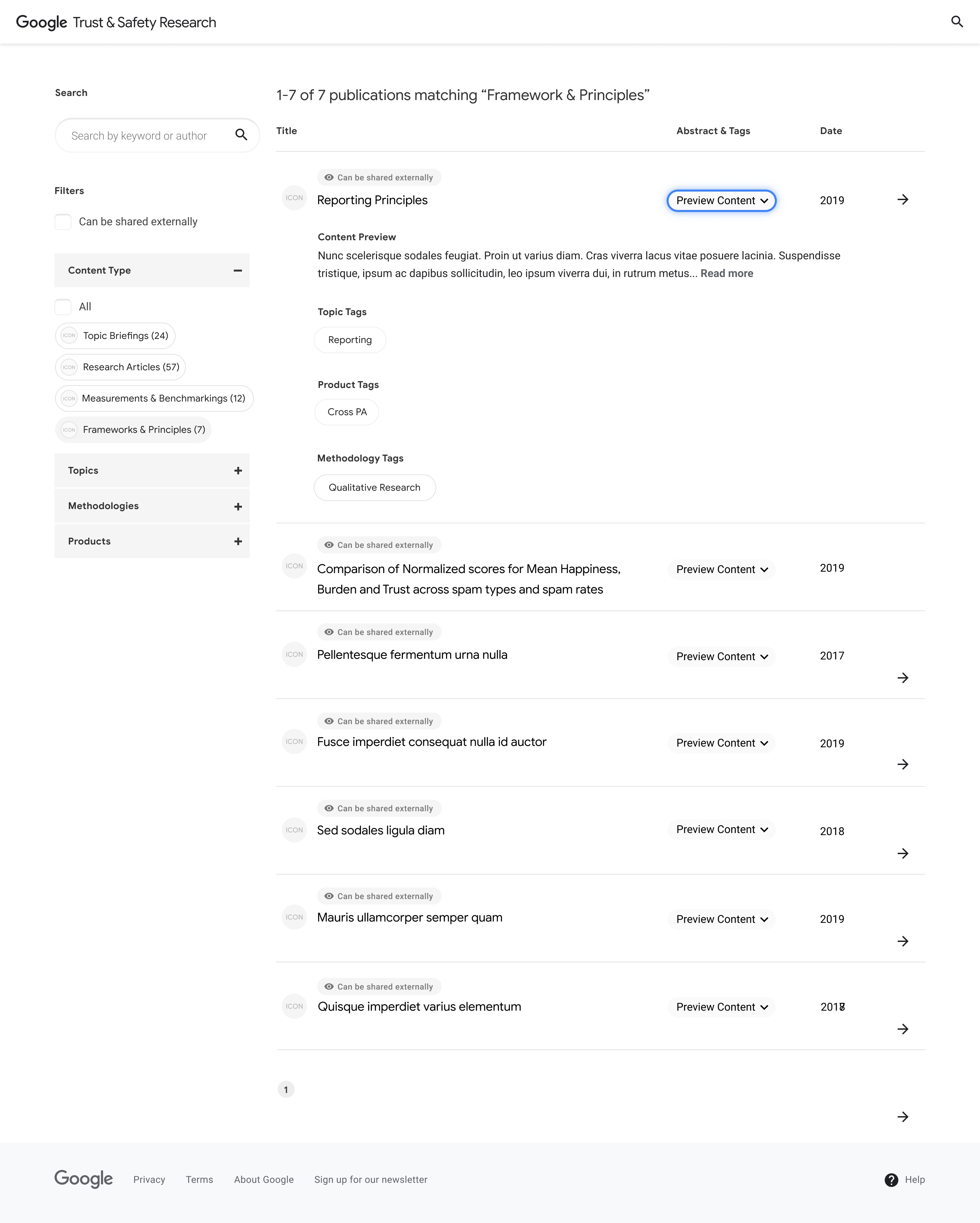
Search Page
With a massive respository of research, this page helps our audiences find what they need. We explored ways to:
- Refine the search with familiar filters powered by our backend tag system.
- Improve scanability of important information, like trigger warnings and access levels.
- Preview content for each result.
Selected Search Page
Additional exploration
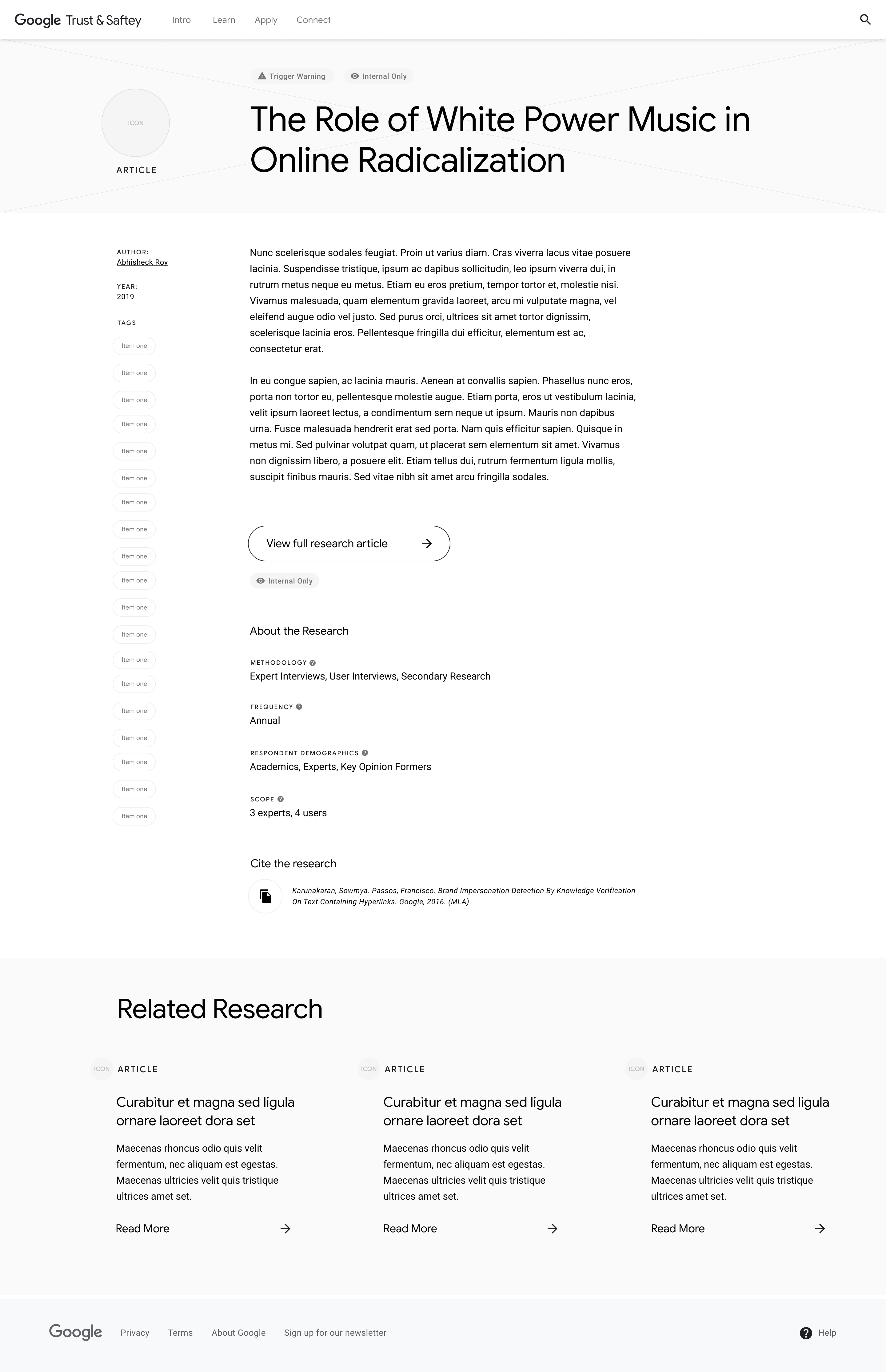
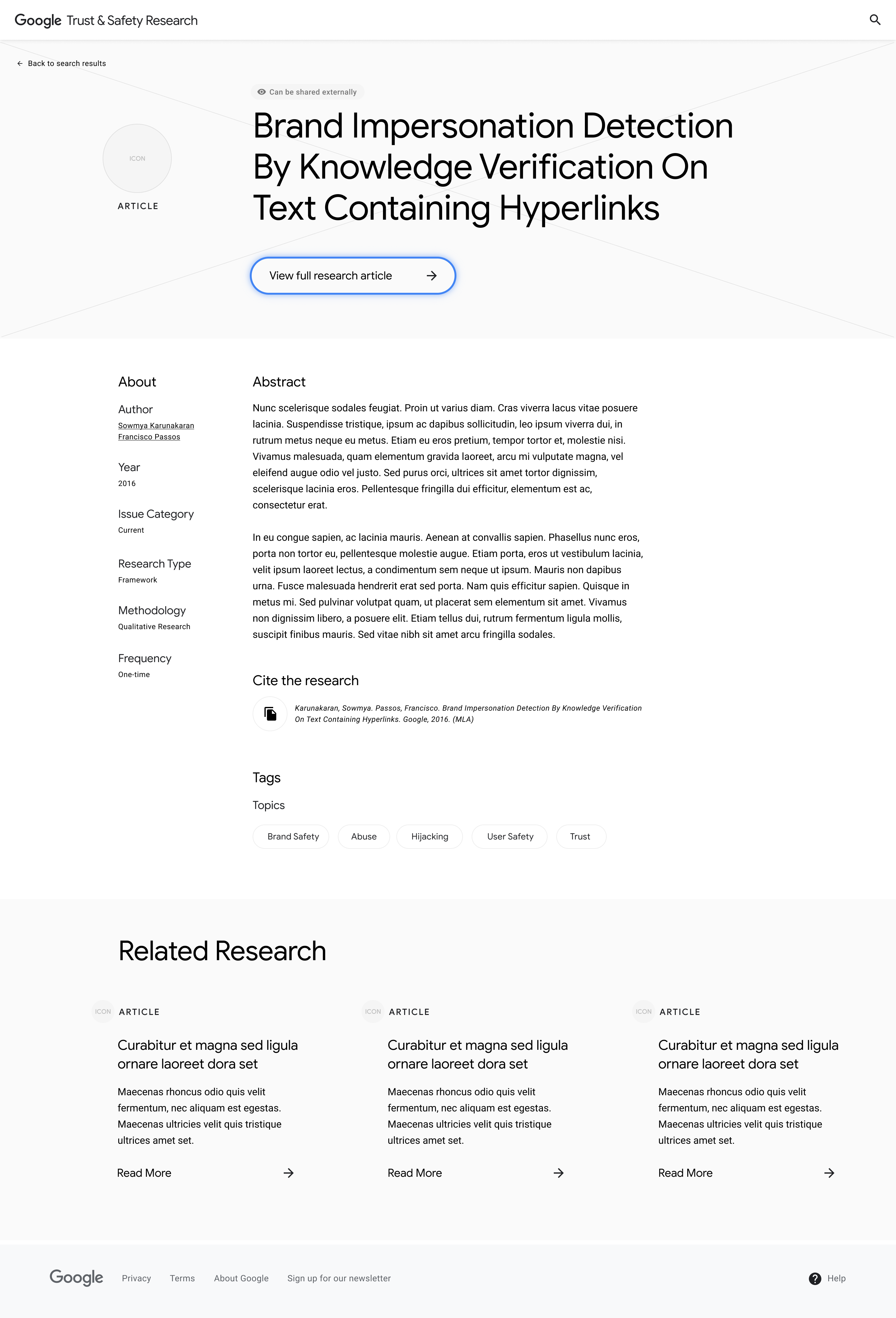
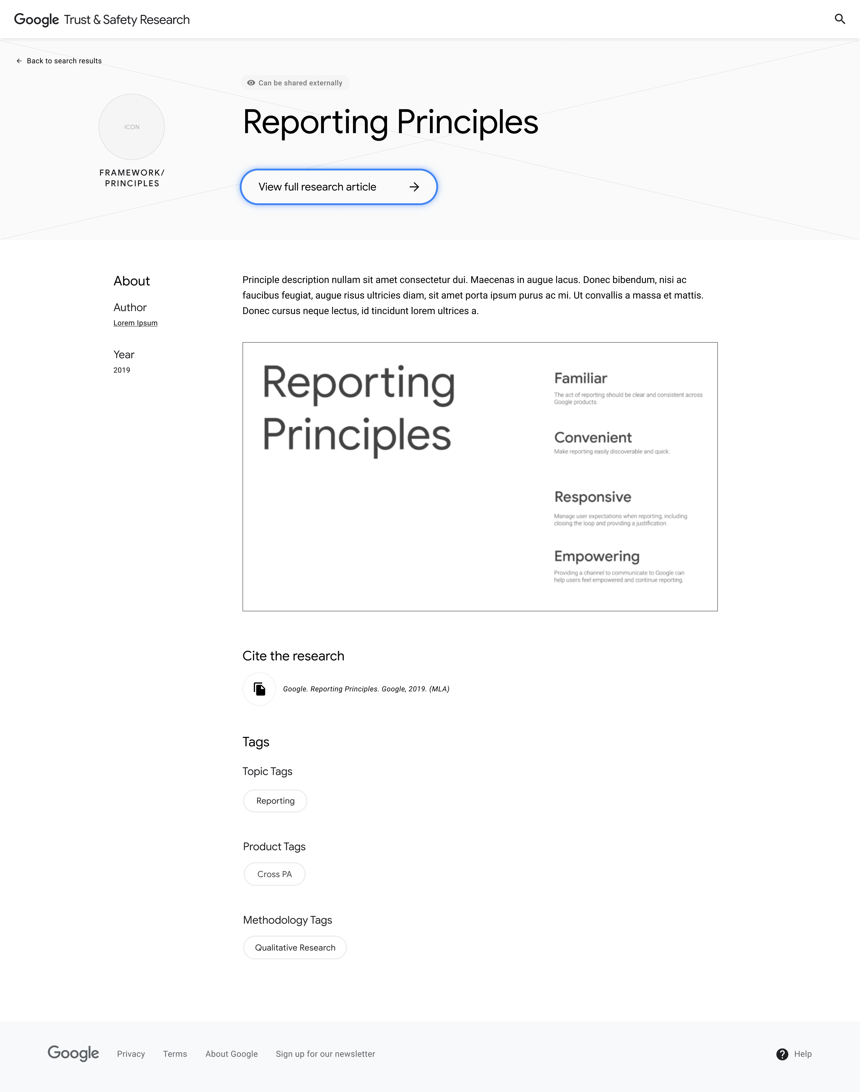
Detail Page
As the container for all T & S research, this page houses multiple research formats. We explored ways to:
- Create a flexible grid to accomodate various content lengths and types.
- Provide clear actions for viewing and citing the full research.
- Surface the tags and related research to encourage discovery.
Selected Detail Page
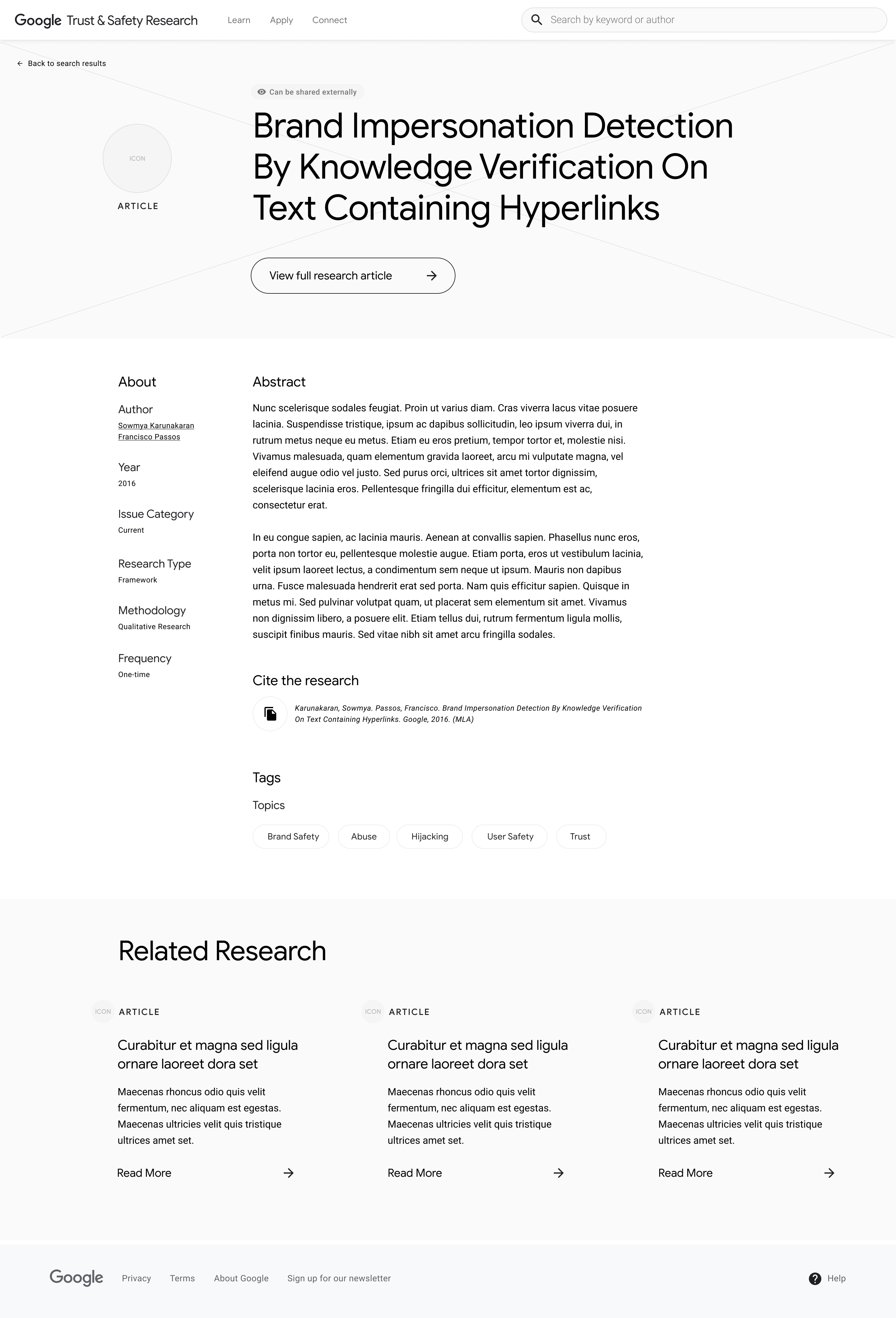
Additional exploration

Solutions in context
To validate our solutions, we returned to our stakeholder interviews. We evaluated the wireframes through user flows based on each audience.
This exercise, conducted in InVision, provided our team & our stakeholders a richer understanding of how the platform would take shape to meet audience needs, and more importantly, what we still needed to address.
Super User
Our Super User is an academic researcher in a Media & Technology department. They are conducting a qualitative study on "digital brand reputation" and want to see how other researchers in this space have conducted their studies.
1
On the T & S platform, our Super User searches for "digital branding."
2
On the Search Page, they filter for Research Articles and Qualitative Research.
3
They find an article of interest and click on the Detail Page to view the full research.
Engaged User
Our Engaged User is a Trust & Safety Officer at a growing social tech company. They are drafting their company's Community Guidelines and want to see what research-based best practices exist.
1
On the Landing Page, our Engaged User jumps to the "Apply" section and selects "View all Frameworks & Principles."
2
Taken to the Search Page, our Engaged User scans the results and expands the preview on an interesting piece.
3
On the Principle Detail Page, our Engaged User chooses to dive in and view the full research.
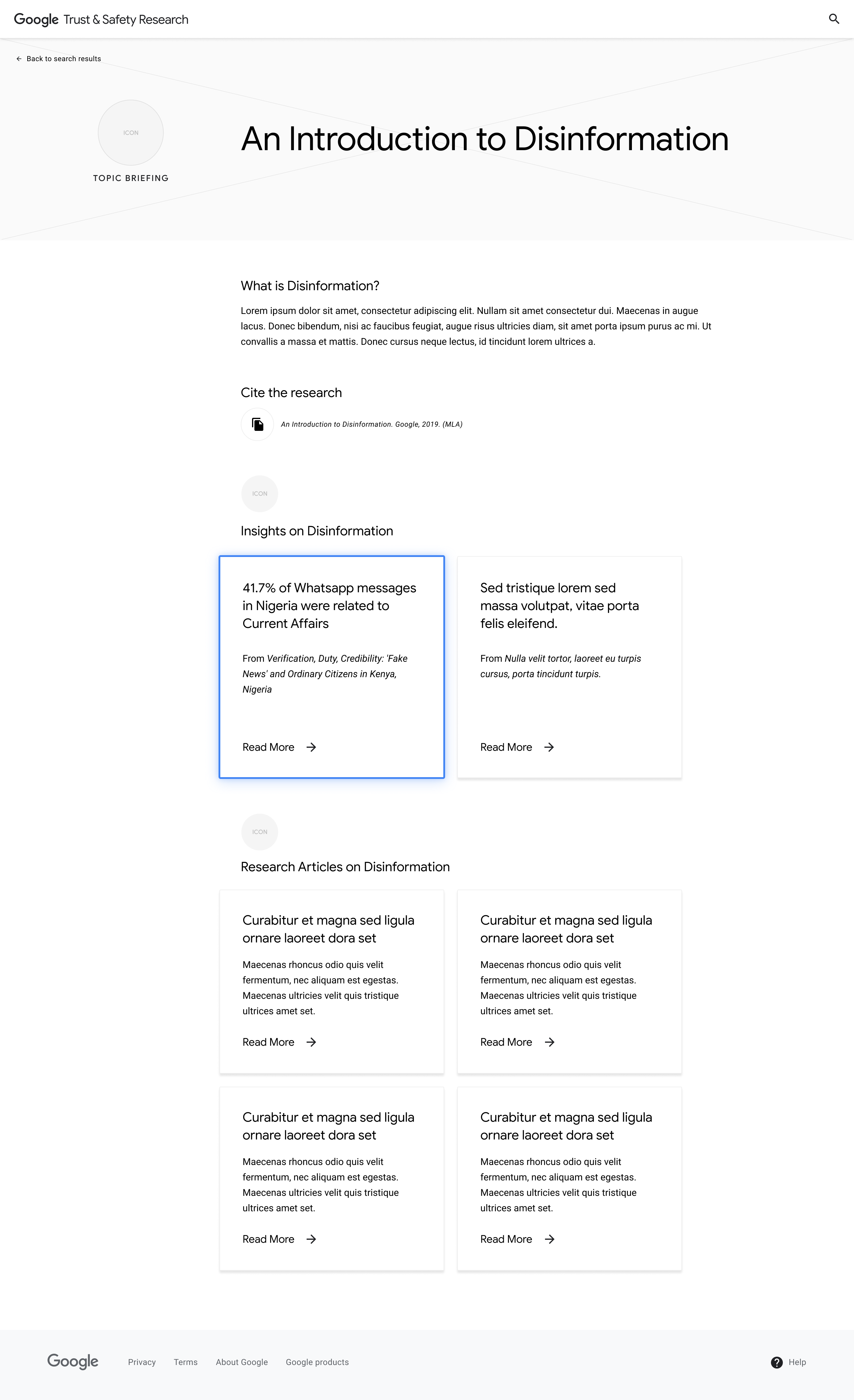
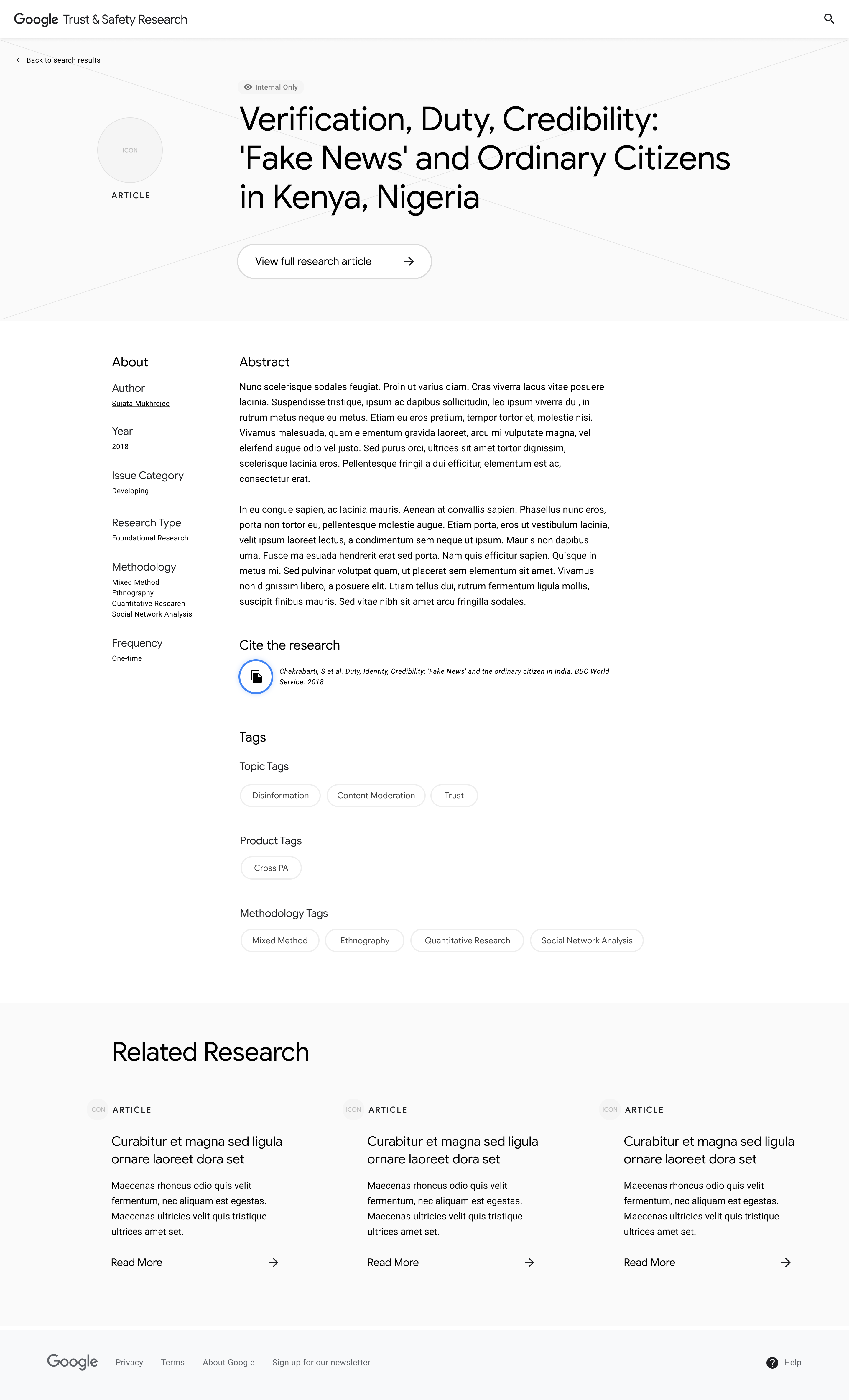
Occasional User
Our Occasional User is the Technology Editor at a digital news organization. They see the term "fake news" trending again on social media; rather than retweeting opinions that reflect their own, they want to see what academic research is available on the subject to write an informed thinkpiece.
1
Above the fold of the Landing Page, our Occasional User sees a Topic Briefing on the day's hot topic: Disinformation.
2
On the Topic Briefing page, a stat catches our Occasional User's eye. They click on the stat to view the associated research.
3
On the Research Detail page, our Occasional User reads the abstract. Interested, they copy the citation for future reference.

Thank you for your awesome creativity in the wireframes. I could see all our prior thoughts and discussions manifested!
– Kalpa Raj, Google T & S Project Manager
Exploring visual design
As we dialed in the page structures, we began exploring the platform's visual design system. To use this time efficiently, we focused our exploration on the first quarter of the Landing Page, which housed the majority of components that would be used throughout the platform.
Exploration 1
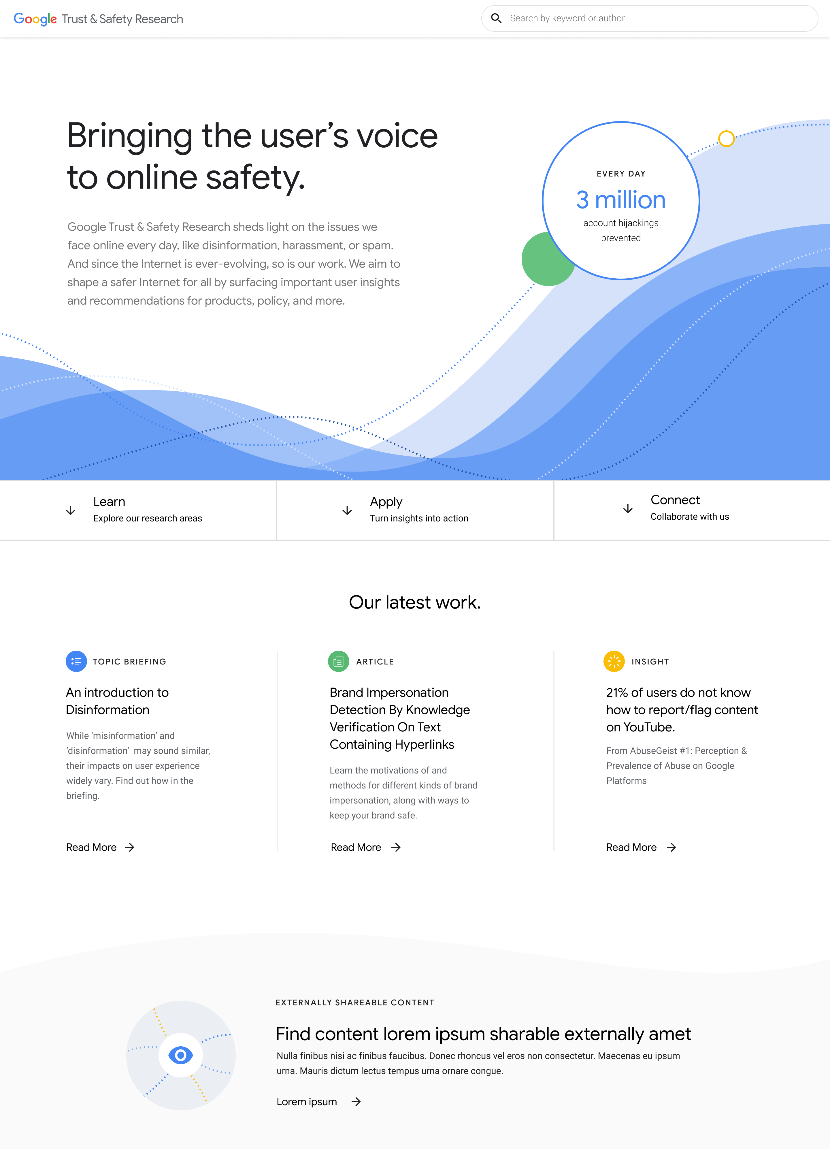
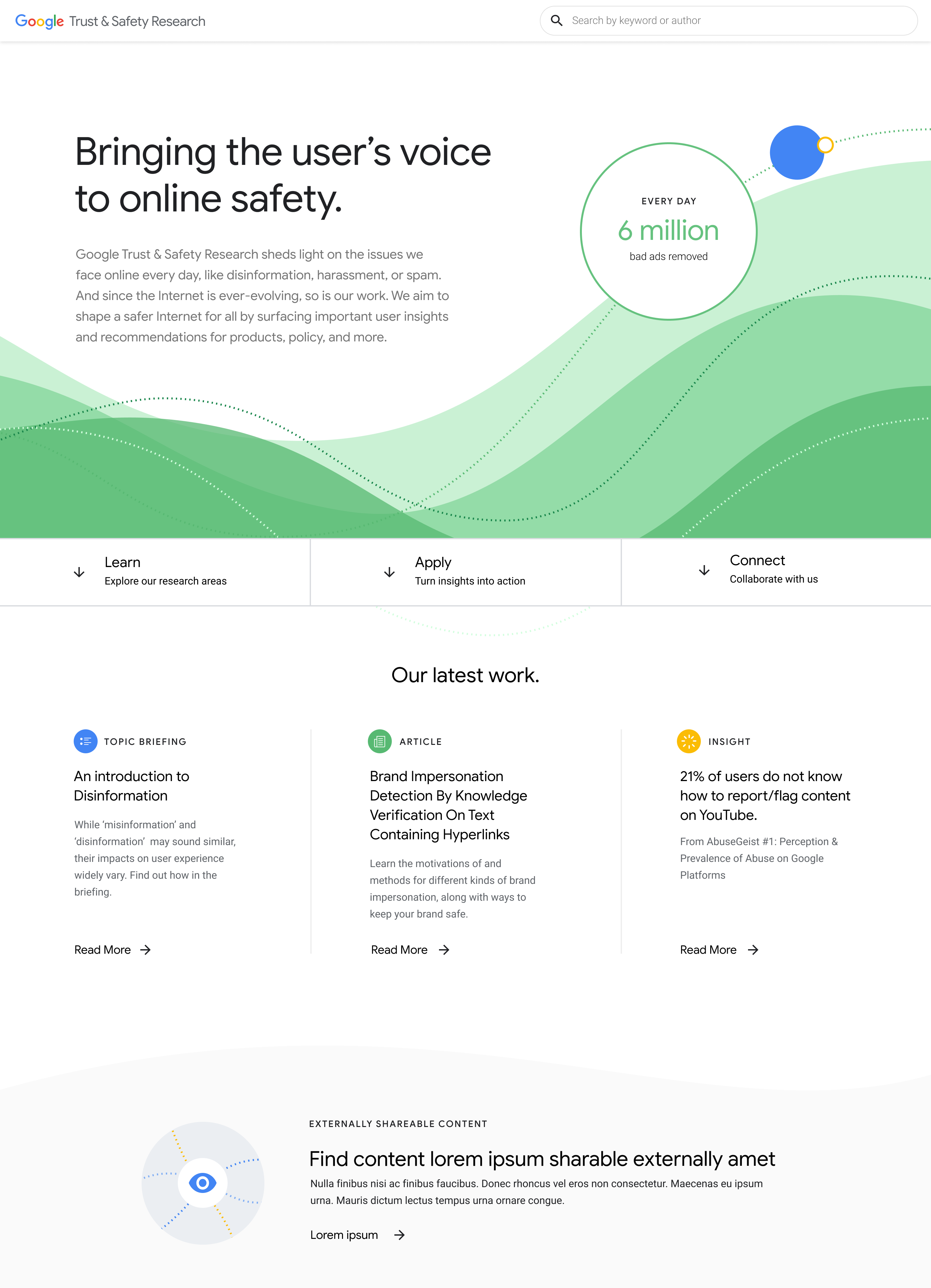
Everchanging Landscape
The Internet is an everchanging landscape; new technologies present new opportunities for online abuse. The T & S research team evolves with it – surveying the landscape and surfacing insights to address these issues.
We visualized this metaphor with layered waves that bubble up key insights in a gradual ebb and flow. On content-heavy pages, this visual would serve as an accent that maintained visual consistency while allowing the content to shine.
State 1
State 2
Exploration 2
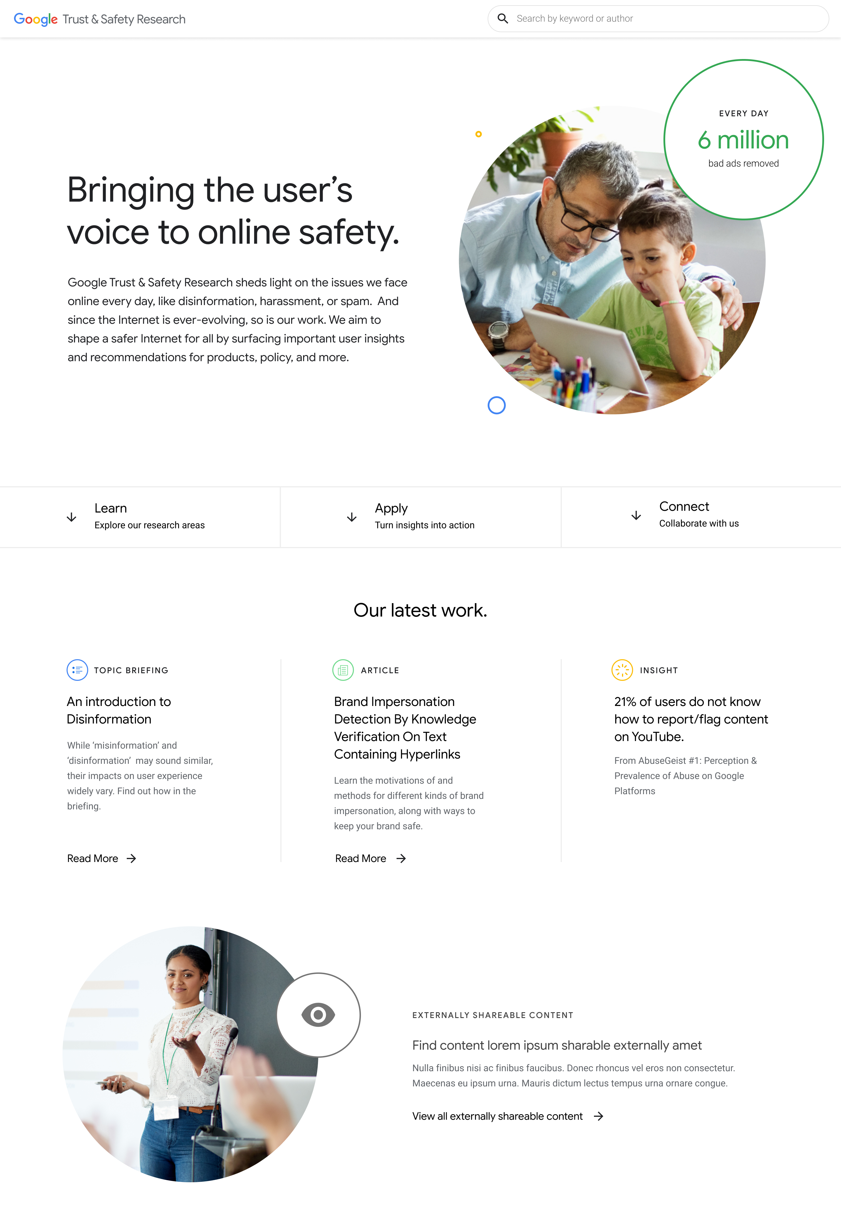
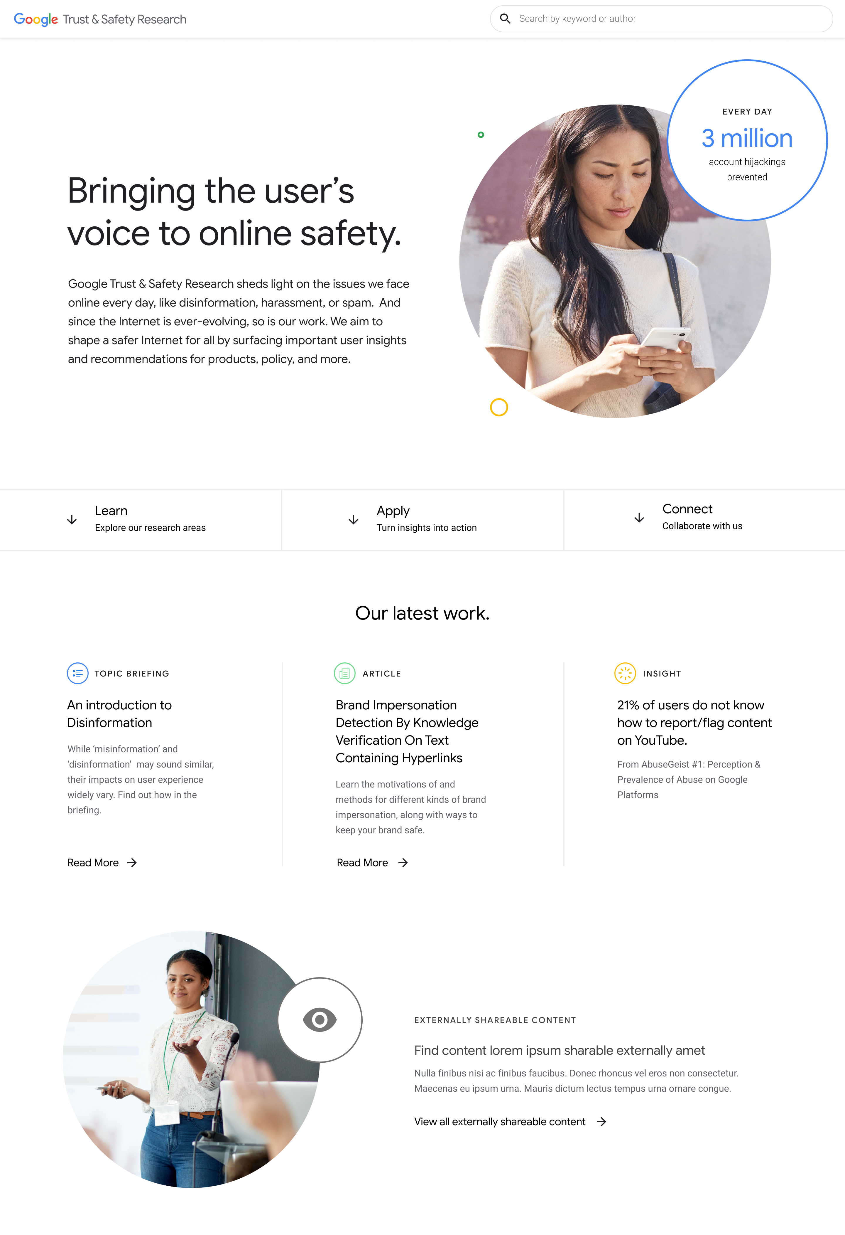
Centering on the User
The end user's safety and well-being is at the core of the T & S team's work.
To humanize the impacts of this research, we brought the user to the forefront. With this photographic approach, we recommended specific areas to include photography and provided opportunities to re-purpose existing Google photography.
State 1
State 2
Exploration 3
Extracting the Web
The amount of information–and disinformation–on the web is overwhelming. T & S research provides insights to inform a clear path forward.
We fashioned Google's brand colors and Material Design components into a visual system that directs viewers' attention attention to key insights and work.
State 1
State 2
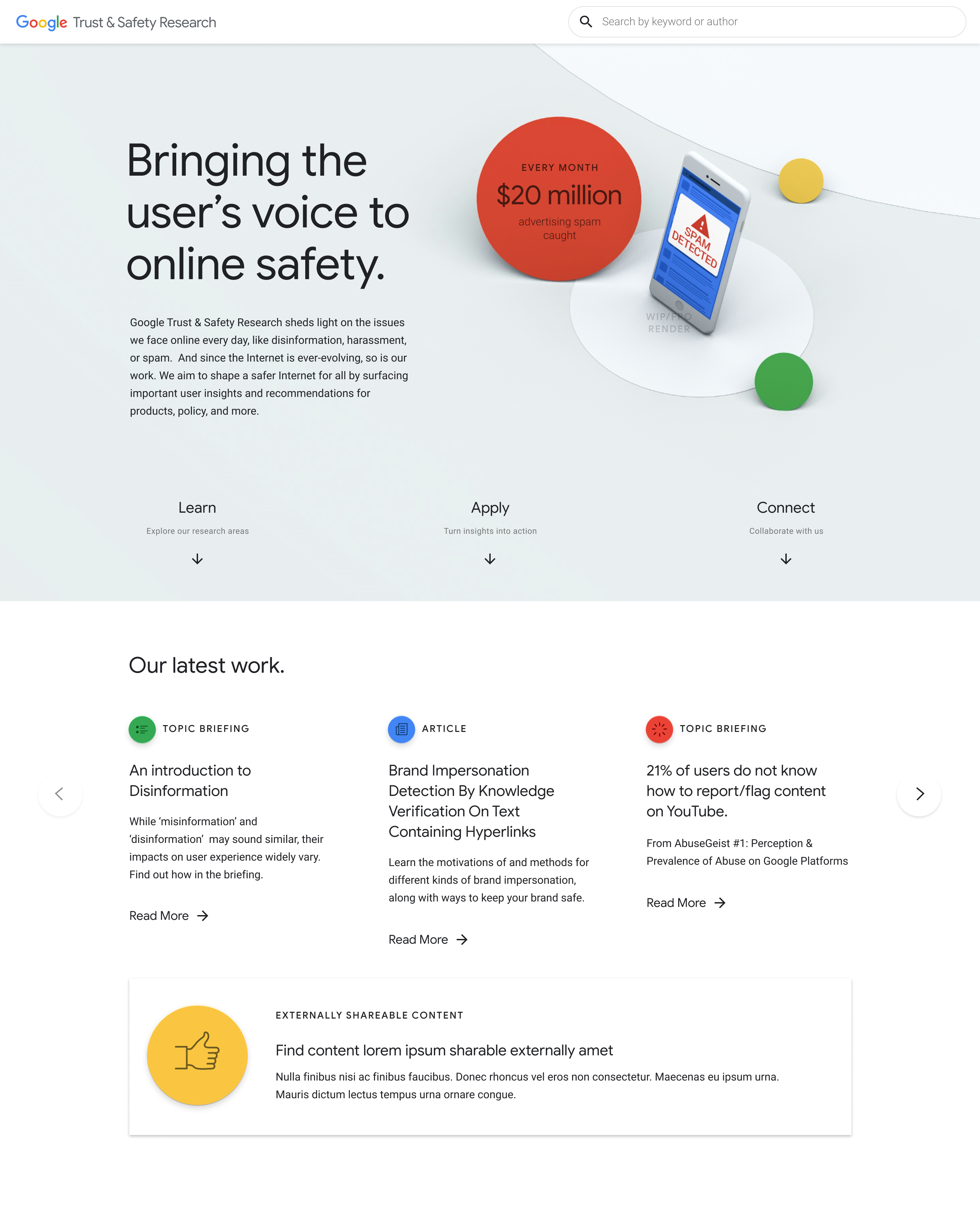
Exploration 4
Modeling Impact
In the face of technical advancement, the T & S research team works continually to keep each user safe across every facet of the web.
We took a more literal approach to raising the profile of T & S research in this 3D treatment. We recommended using 3D selectively throughout the platform and provided opportunities to update models, keeping the content fresh.
State 1
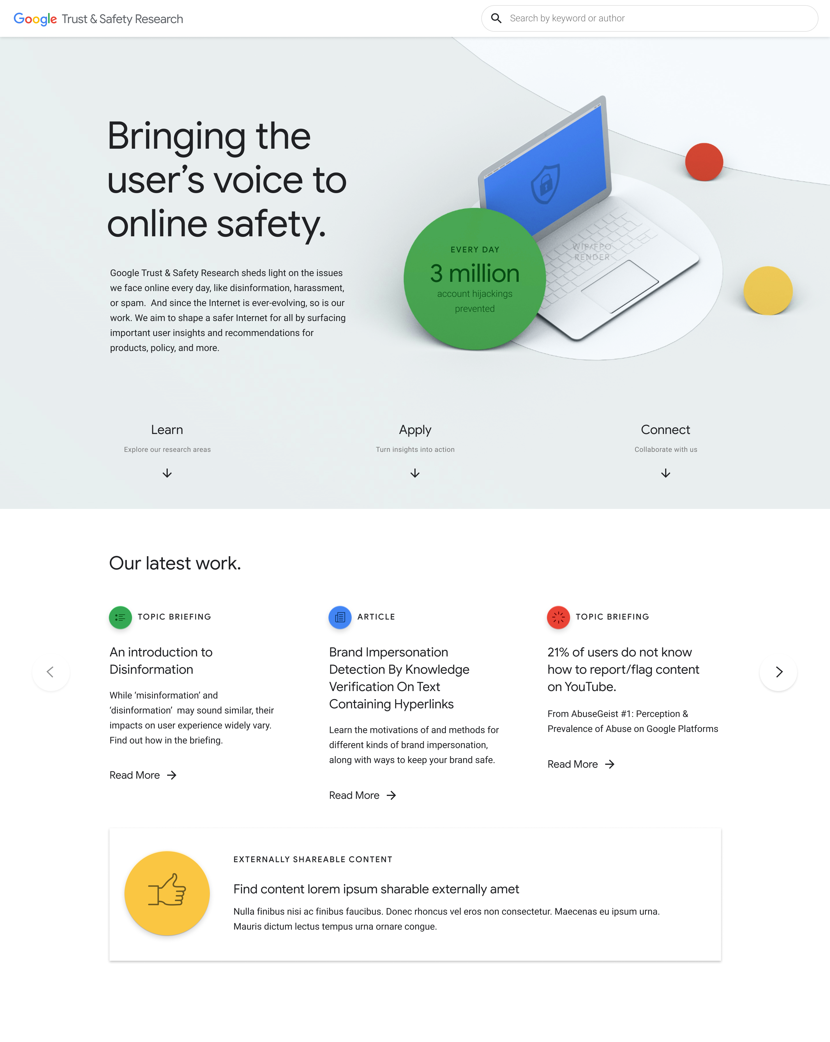
State 2
Unifying the design system
In a collaborative work session with the T & S team, we aligned on a design system that builds off of Google's "Build from white" ethos and marries the key components of Explorations 1 and 3.
Waves
We represent the vast online landscape with layered waves.
Landing Page - Intro
Raised Cards
We elevate T & S work with raised card components.
Landing Page - Apply Section
Icons
We focus attention on T & S offerings with direct iconography.
Landing Page - Explore Section
Extending the system
In the process of building out the platform's design system, we discovered an opportunity to extend the system into the presentation of the research itself. We learned that each researcher or research team is responsible for designing the presentation of their research, creating issues at every level of engagement.
The Issues
Issue 1
A burden for researchers
There are no presentation design guidelines. As a result, coming up with a unique design for the research presentation is a burden on the responsible individuals.
Issue 2
A disparity for T & S as a whole
Because each presentation is designed by a different individual, there is a lack of consistency. This makes it difficult to tie the work back to the T & S team.
Issue 3
A sore sight for visitors
When the presentation is uploaded to the platform, the extrapolated elements visually stand out – and not in a good way.
The Solution
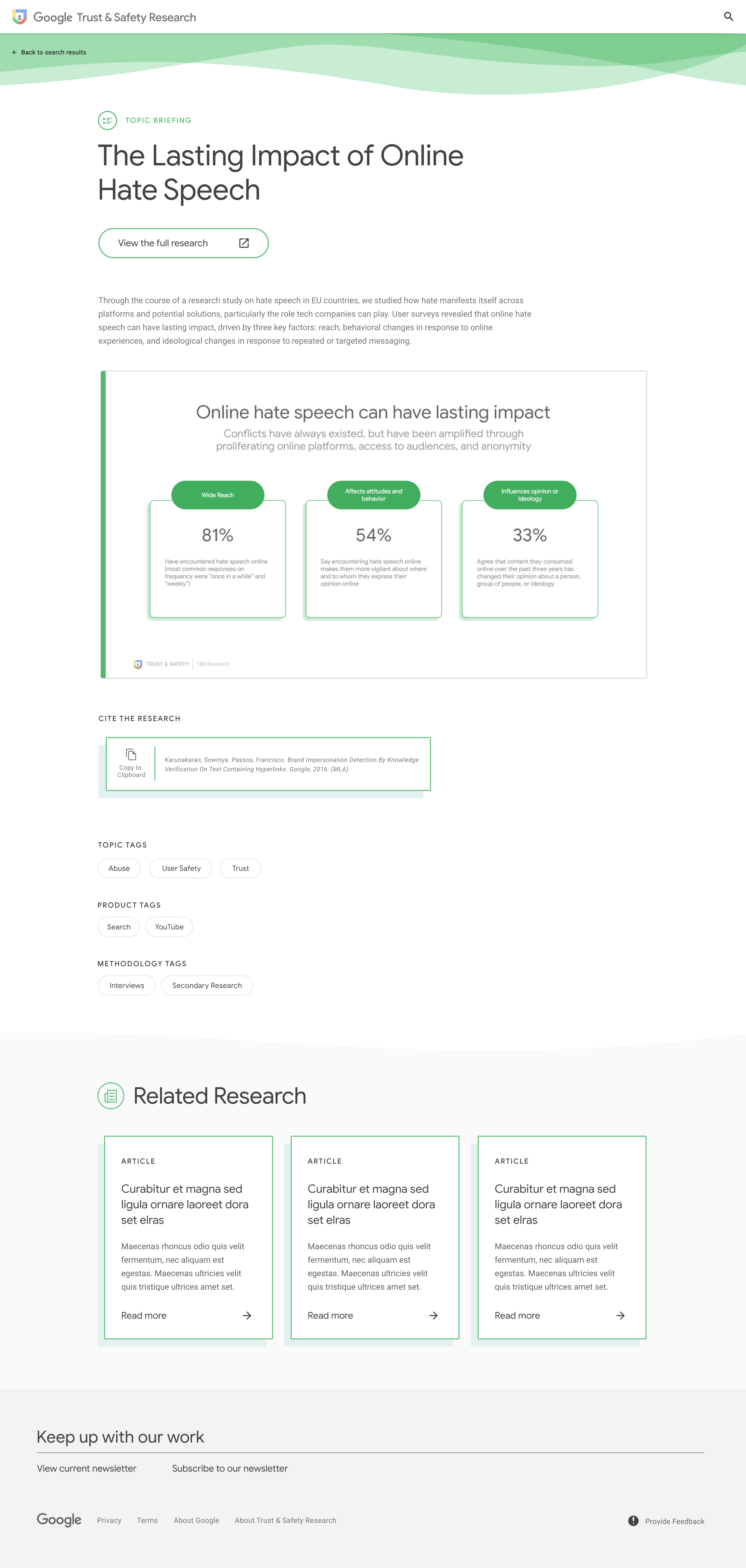
To address these issues, we worked with the T & S team to identify the key presentation formats their researchers use, and created a series of branded Google Slides templates for researchers to use moving forward. Here's a sample selection:
Title

Text with Editable Graph

Alternate Graphs

Text with Insight Stat

Table

User Journey

Topic Briefing Overview

Scale

Country Comparison - Multi

Country Comparison - Single

Product Comparison - Multi

Product Comparison - Single

Flexible Guidelines
We provided guidelines for researchers to create their own templates, knowing that their presentation needs may evolve with their research.
2-column Guideline

1-column Guideline

Color Guidelines

Typography Guidelines

Putting the system into action
The full design system comes together as a responsive platform. Based on our audiences' usage habits, we knew people would most frequently interact with the platform on desktop devices. Still, we applied touch-friendly ways to engage with the content to ensure those on tablet and mobile devices would have just as fulfilling an experience.
Landing - Desktop
Landing - Mobile

Search - Desktop
Search - Mobile
Topic Briefing - Desktop
Article - Mobile

This is amazing work. Let's continue this partnership for the external launch.
– Kalpa Raj, Google T & S Project Manager
Looking forward & reflecting back
In January 2020, the Trust & Safety Research platform launched internally to Google employees. The external launch of the platform is currently in progress. Additionally, the positive partnership with our client has led to a new project with another Trust & Safety team.
Over the 3 months my team & I took the internal site from strategy to launch, we learned several valuable lessons that strengthened the way we work with one another & with our clients.
Takeaway 1
Design a system, not elements.
Creating a design system allows us to evaluate individual element as part of a whole; we can determine whether a button style works, or is even necessary. A system also creates a shared language between the design and development teams, and with our clients.
Links for learning
Takeaway 2
Make magic in the micro.
While the platform is designed with functionality in mind, that doesn’t mean it has to be boring. We implemented delightful microinteractions, such as a card raise on mouseover and a logo animation on page load, to bring some personality into the system.
Links for learning
Takeaway 3
Be helpful.
Just like Google, helpfulness is at the core of our work as a partner. By working closely with our client to understand stakeholder needs and goals, we helped sell in work across multiple levels of approval.
Links for learning
Reach Out
If you’d like to learn more about this project or chat about a future collaboration, I’d love to hear from you.
You can reach me by email at janice.jamye.pang@gmail.com 💌